Interesting fact...
Posted: Thu Aug 20, 2009 10:43 pm
According to Google Analytics... we're getting a half-dozen hits a day from Dehli, India....
HI!!!!!!!!!!!!!!!
HI!!!!!!!!!!!!!!!
Home of Falcon Fans Online!
https://www.ay-ziggy-zoomba.com/phpBB3/
https://www.ay-ziggy-zoomba.com/phpBB3/viewtopic.php?f=11&t=24260
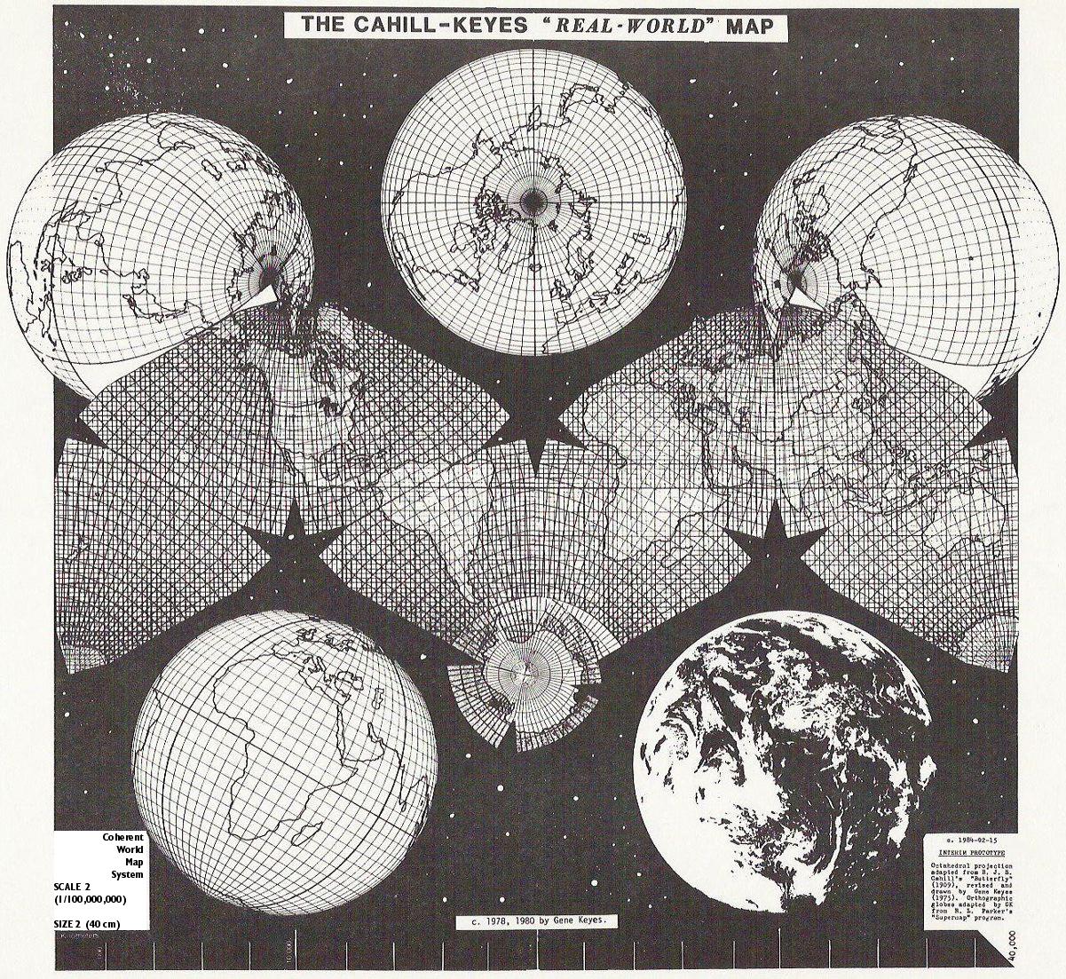
Unfortunately, I'm going to try to answer this with a somewhat accurate answer that I can remember, so I may ruin the fun by putting facts to this. I believe things look out of proportion because of the map style being used. The Earth is a globe, so to stretch the map to a rectangular shape means stretching things out at the poles. If you notice, all lines of longitude touch at both poles, where here they are parallel to each other, or would be if they were shown. A more accurate depiction is one where they actually try to cut parts out and paste them in weird angles. I'll try to find an example of this and post it below.Ydfalcon wrote:Is it just me or is Alaska disproportionately large on that map? It looks to be roughly 2/3 the size of the rest of the US, if not more.

Bleeding Orange wrote:The relative distortion you are seeing in this map is due to it's projection, or in other words the two-dimensional depiction of the earth's surface relative to it's three-dimensional reality. In this case, the map is presented Mercator projection, which is a cylindrical representation of the earth's surface (imagine the earth's surface unglued, flattened out, and wrapped around the outside of a tube). So, everything near the poles is greatly distorted because the latitudinal lines are all parallel, and thus theoretically go on into infinity. As I recall, this projection is used for navigational purposes because it allows for accurate depictions of distance.
Why does my geography minor only come in handy when I'm slightly drunk? Either way, I'm a nerd. No comments.
Hey, think of it this way - you and I are among the .0005% of the world's population who knows what the Coriolis Effect is. So we have that going for us. Which is nice.USGFreddie05-06 wrote:Bleeding Orange wrote:The relative distortion you are seeing in this map is due to it's projection, or in other words the two-dimensional depiction of the earth's surface relative to it's three-dimensional reality. In this case, the map is presented Mercator projection, which is a cylindrical representation of the earth's surface (imagine the earth's surface unglued, flattened out, and wrapped around the outside of a tube). So, everything near the poles is greatly distorted because the latitudinal lines are all parallel, and thus theoretically go on into infinity. As I recall, this projection is used for navigational purposes because it allows for accurate depictions of distance.
Why does my geography minor only come in handy when I'm slightly drunk? Either way, I'm a nerd. No comments.
It could be worse; you could have been a geography major! And from what I remember, you are absolutely correct!