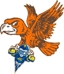
It just keeps getting WORSE!
Re: It just keeps getting WORSE!
On second glance, does he/she have breasts?
Check out our new BGSU hockey site: http://www.bgsuhockey.com
- VDub26Falcon
- The Drunken Irish Falcon

- Posts: 4710
- Joined: Mon Mar 26, 2007 3:19 pm
- Location: Elyria, OH
- Contact:
Re: It just keeps getting WORSE!
After studying the image further, it seems to me that the mask is a combination between Astronaut, Medieval Knight and Spartan guard...anyone else see that???
Be Special, Be Different, BE Bowling Green - Dino Babers
-
Freakling1
Re: It just keeps getting WORSE!
YesVDub26Falcon wrote:After studying the image further, it seems to me that the mask is a combination between Astronaut, Medieval Knight and Spartan guard...anyone else see that???
- Rightupinthere
- Mercenary of Churlishness

- Posts: 6549
- Joined: Fri Jul 23, 2004 7:53 am
- Location: Ye Olde Pigeon Hole
Re: It just keeps getting WORSE!
You would see breasts on a number 2 lead pencil, Drew.BGDrew wrote:On second glance, does he/she have breasts?
"Science doesn’t know everything? Well science KNOWS it doesn’t know everything… otherwise it’d stop."
Dara O'Brian - Comedian
Dara O'Brian - Comedian
Re: It just keeps getting WORSE!
Say what you will, #2's are trannies!
Check out our new BGSU hockey site: http://www.bgsuhockey.com
Re: It just keeps getting WORSE!
The perspective he is flying leads me to believe his legs are actually straight back. Does that mean he now wears an icicle kilt and that's what's hanging down in front?
From a designers perspective though, the logo is actually more along the lines of where logos/mascots are going. Look at our Freddie and Frieda compared to the old ones. These things in sports are getting more cartoon-ish, probably to not scare the kids. I'm a fan of the Toledo through a rocket though...I like simplicity in logo designs and that one worked great.
From a designers perspective though, the logo is actually more along the lines of where logos/mascots are going. Look at our Freddie and Frieda compared to the old ones. These things in sports are getting more cartoon-ish, probably to not scare the kids. I'm a fan of the Toledo through a rocket though...I like simplicity in logo designs and that one worked great.
"To the optimist, the glass is half full. To the pessimist, the glass is half empty. To the project manager, the glass is twice as big as it needs to be."
- VDub26Falcon
- The Drunken Irish Falcon

- Posts: 4710
- Joined: Mon Mar 26, 2007 3:19 pm
- Location: Elyria, OH
- Contact:
Re: It just keeps getting WORSE!
They should have made the head of the logo Elton John's head, complete with HUGE sunglasses.
Be Special, Be Different, BE Bowling Green - Dino Babers


