Page 1 of 4
New Court For Anderson Arena?
Posted: Fri Mar 18, 2005 3:08 pm
by Dayons_Den
So yeah it is the off season and this means not much team related stuff to talk about. This is an opportunity for me to share some concepts on uniforms and field designs for the falcons. here is the first one for anderson arean.
I think "Bowling Green" has been missing from the floor and also think anderson arena should be on there somewhere also. Good to put the new word marks and logo on there. . .
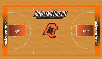
I think the fade orange and brown would give us a more modern feel and I also miss the Paint... being... paint

Would love comments or suggestions. . I love messing with this stuff. .
Posted: Fri Mar 18, 2005 3:12 pm
by thewebboy
not bad.
I would have to say that the ends of the court should say "BOWLING GREEN" or "FALCONS" though.
I agree the paint looks good when its paint, but i've seen some pretty sweet courts that don't go by that.
Posted: Fri Mar 18, 2005 3:13 pm
by Falconfreak90
That looks great, DD! That floor would rock.
Just throw the MAC logo on either side of midcourt and you're there.
Posted: Fri Mar 18, 2005 3:16 pm
by TG1996
Falconfreak90 wrote:That looks great, DD! That floor would rock.
Just throw the MAC logo on either side of midcourt and you're there.
jeez, Freak, how many MAC logos do you want!?!?

Posted: Fri Mar 18, 2005 3:16 pm
by Dayons_Den
thewebboy wrote:not bad.
I would have to say that the ends of the court should say "BOWLING GREEN" or "FALCONS" though.
I agree the paint looks good when its paint, but i've seen some pretty sweet courts that don't go by that.
I know that "Bowling Green" and "Falcons" is usually on the end line, but often that is obstructed by cheerleaders, towel boys etc. I was designing this court so that t.v. cameras would best pick up the name- thats why the new logo-word mark is on the bench side, but faces the student section and why the MAC logos are in the paint. . .
Although I want Anderson Arena on the floor it loses out to the school name in priority and woudl be cluttered if I put it on the court, I think.
I liked courts when they were goign to the no paint in the paint and less paint around the edges but I think the trend is back to more paint. . .
look for my new football field soon. . .
Posted: Fri Mar 18, 2005 3:17 pm
by Metz
I heard they are actually planning on repainting it in the offseason so your idea could come true!
Posted: Fri Mar 18, 2005 3:20 pm
by PGY Tiercel
I like putting AA on the ends, However it would look better stretched all the way from side to side.
Posted: Fri Mar 18, 2005 3:20 pm
by UK Peregrine
I would like to see the two MAC emblems near midcourt and on the bottom. Then in the paint, I would maybe put Falcons or something. All and all, great design DD. When you proof this out, I think it should be sent Dackich's or Krebs's way.
Posted: Fri Mar 18, 2005 3:30 pm
by Dayons_Den
McMetz811 wrote:I heard they are actually planning on repainting it in the offseason so your idea could come true!
That would be
two basketball courts in the city of Bowling Green I have designed. . .
Posted: Fri Mar 18, 2005 3:33 pm
by Falconfreak90
TG1996 wrote:Falconfreak90 wrote:That looks great, DD! That floor would rock.
Just throw the MAC logo on either side of midcourt and you're there.
jeez, Freak, how many MAC logos do you want!?!?
Ummm....sorry about that fellas. I am watching the time today trying to get outta here by 6pm. We fly to Tampa in 5 days and my brain is filled with Palm Trees and sand.
Posted: Fri Mar 18, 2005 3:46 pm
by BG EV
Personally this layout is great - but, Dan is from the Indiana (Bobby K) camp and actually removed the paint etc for the current look.
The Boise arena looked fantastic on TV - of course it was large enough to host a tournament game so it is LARGE. But the big logo in the middle and the bronco heads stretching from 3-point arch to the other side of the arch was impressive.
Posted: Fri Mar 18, 2005 3:51 pm
by SaxyIrishTenor
I think that looks great, DD. I agree with PGY though - "Anderson Arena" could be bigger and stretched out. Not only is it "home," but you might be able to see it better even if the cheerleaders are on it.
Posted: Fri Mar 18, 2005 3:57 pm
by BGDrew
Hey Dayon, think I could get a copy of your template to mess around with? After looking at Boise's floor yesterday I've been looking for one.
Posted: Fri Mar 18, 2005 4:12 pm
by 1987alum
DD:
The Campaign loves the idea. I might make it one of the planks in our platform.

mm.....
Posted: Fri Mar 18, 2005 4:13 pm
by Falconboy
Yeah, updating the floor of AA does seem like a good idea to me!
