

+1, RUIT and, "Amen."Rightupinthere wrote:I agree with this and it's is why I haven't completely "bought in" to the new logo. I don't like the idea of starting over. By starting over, I mean that BG was getting recognition and notoriety with the current "simple" logo. Changing takes a step back - however little or great that step was. Instead of viewing the logo change from a purely sexual angle, I'm viewing it from a business perspective.Schadenfreude wrote: If we were starting the university from scratch, and the two logos were the finalists in some sort of contest, there is no way on God's green earth that we would be choosing the traditional logo.
But, I know I can't fight fashion - even though I'm wearing Chuckie high tops with shorts right now. I favor the peak-a-boo over the new logo solo (like hammb).
I'm sorry, brother, but I just don't agree that it was showing any sort of age. The simplicity of the logo made it timeless. Think GE, Chevy, Ford, Detroit Lions, New York Yankees, etc. Yes, I'm equating BG with those examples.Schadenfreude wrote:The one we had was never going to last that long. It was showing its age.
I do like the "BG" on the helmet. It would have been awesome with the traditional on the shoulders. Again, not fighting fashion just stating my favor.
New Helmets
-
FalconTurf
- Peregrine

- Posts: 1491
- Joined: Sun May 20, 2007 9:37 pm
I don't buy this traditional logo stuff. I remember having a poster of all the NFL helmets as a kid (wish I still had it) and the logos on the helmets were outdated the day I bought it. Nearly every team tweaks the logo slightly. A brief Google search on the Pepsi and GM logos indicates to me that they have tweaked and modified. GM actually used a cursive GM at one point. Every business updates their recipe for success as well as how they represent themselves.
I like the new "spaceghost" as it may be called by some. It updates a excellent outline and that is all the "LT" logo is, an outline of a falcon head. Unfortunately it took the athletic department a long time to find a good way to fill it in.
I like the new "spaceghost" as it may be called by some. It updates a excellent outline and that is all the "LT" logo is, an outline of a falcon head. Unfortunately it took the athletic department a long time to find a good way to fill it in.
I proudly chose to be a Falcon and a Falcon I will remain until the end.
-
Flipper
- The Global Village Idiot

- Posts: 18396
- Joined: Fri Jul 23, 2004 1:01 am
- Location: Ida Twp, MI

Amen...that isn't a Lion, it's a kitty. The logo on the helmet looks like a kitten playing with a ball of yarn.Warthog wrote:I think the Lions logo looks like something a kindergartener drew up. I laugh every time I see it and think "is that really the logo for a professional sports team?".
Sentimentality aside....I'm glad we're making a change. I definitely think the peek a boo logo should be on the helmet though...although I'm down with the interlocking "BG"...I think it is something of a tradition for us to have a representation of a falcon head on our helmets
It's not the fall that hurts...it's when you hit the ground.

Best Logo in the history of sports?Flipper wrote:Amen...that isn't a Lion, it's a kitty. The logo on the helmet looks like a kitten playing with a ball of yarn.Warthog wrote:I think the Lions logo looks like something a kindergartener drew up. I laugh every time I see it and think "is that really the logo for a professional sports team?".
Sentimentality aside....I'm glad we're making a change. I definitely think the peek a boo logo should be on the helmet though...although I'm down with the interlocking "BG"...I think it is something of a tradition for us to have a representation of a falcon head on our helmets
I think yes:


-
ZiggyZoomba
- The Wizard of AZZ

- Posts: 5916
- Joined: Sun Apr 11, 2004 5:37 pm
- Location: Elmore, OH
Speaking of logos...
They're updating the venue signage on campus...
Old:
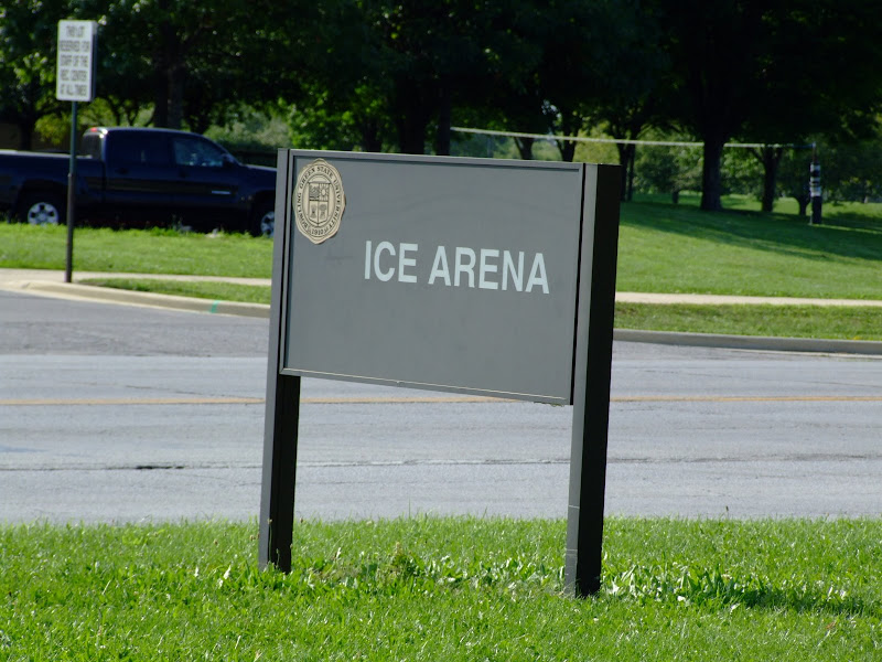
New:
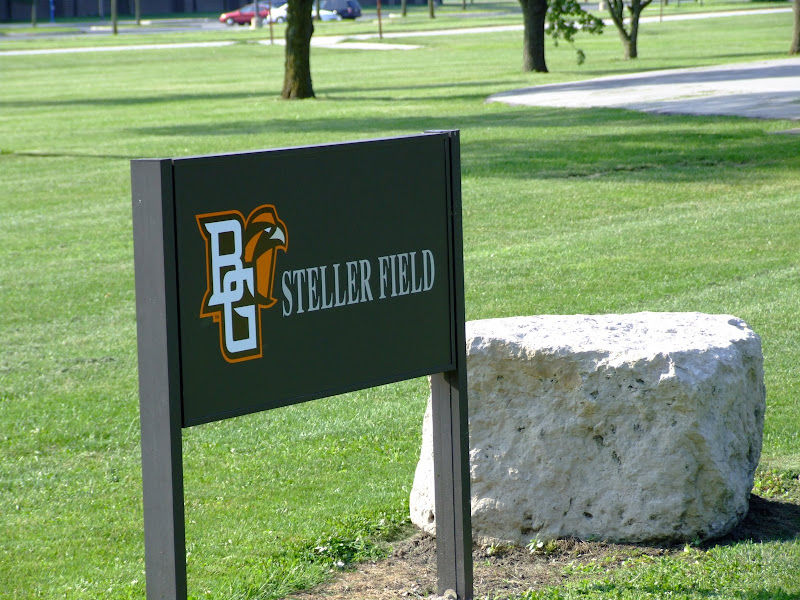
They're updating the venue signage on campus...
Old:
New:
Grant Cummings
ROLL ALONG!!!
"We are linked to this institution by invisible bonds that do not wither or dissolve." --BGSU President, Dr. Ralph W. McDonald - 1968
ROLL ALONG!!!
"We are linked to this institution by invisible bonds that do not wither or dissolve." --BGSU President, Dr. Ralph W. McDonald - 1968
Filthy bastard. I took a pic of the Steller Field sign Monday to show off here, and you go stomping all over me, just because I don't have a home right now...ZiggyZoomba wrote:Speaking of logos...
They're updating the venue signage on campus...
"I don't believe I can name a coach, anywhere, anytime, anyhow, who did it better than Doyt Perry."
-1955 BG Assistant Bo Schembechler
BGSUsports.com - Where ESPN.com goes for BG history.
-1955 BG Assistant Bo Schembechler
BGSUsports.com - Where ESPN.com goes for BG history.


Can anybody get an actual picture
Can any of the chosen ones fortunate enough to see the new helmets snap a decent photo of one and post it to the site? I'm eager to see something other then the Grit Iron photoshop job that is on bgsufalcons.com.
"Do, or do not. There is no try!" - Master Yoda
Re: Can anybody get an actual picture
Destroyer:destroyer wrote:Can any of the chosen ones fortunate enough to see the new helmets snap a decent photo of one and post it to the site? I'm eager to see something other then the Grit Iron photoshop job that is on bgsufalcons.com.
The team is practicing in plain orange helmets, so I don't think any "real" pictures are available.
BTW, I believe Master Yoda's quote is drawn from another philospher ... 8)
-
transfer2BGSU
- Peregrine
- Posts: 5829
- Joined: Fri Jul 23, 2004 8:50 am
- Location: Jed's, Myle's Pizza, Corner Grill
Re: Can anybody get an actual picture
The on featured on the Grit Iron page looks just like what you are going to see in person.destroyer wrote:Can any of the chosen ones fortunate enough to see the new helmets snap a decent photo of one and post it to the site? I'm eager to see something other then the Grit Iron photoshop job that is on bgsufalcons.com.
Honestly having seen one in person, they do not look bad at all. This coming from someone who feels we have gone the wrong route by installing that fake green stuff over where the precious green sod of Perry Stadium still should be laying because as we all well know....
FOOTBALL IS MEANT TO BE PLAYED ON GRASS!!!!!
There, I feel much better now.
"The name on the front of the jersey is more important than the name on the back" -Herb Brooks
