

I don't know if this has been posted yet or not, but there is a poll on http://www.bgsufalcons.com (scroll to the bottom, it's on the right) posing the question:
Which Falcon Head design is your favorite:
Right now the results are as follows:
One-color traditional mark - 46.4% (313 votes)
Two-color revised athletic mark - 27.0% (182 votes)
Full color retail mark - 26.6% (179 votes)
I know many of us have strong opinions on the subject, so now would be a good time for you to make your views known. Vote early and vote often!!
Logo poll on official website
-
ZiggyZoomba
- The Wizard of AZZ

- Posts: 5916
- Joined: Sun Apr 11, 2004 5:37 pm
- Location: Elmore, OH
Logo poll on official website
Grant Cummings
ROLL ALONG!!!
"We are linked to this institution by invisible bonds that do not wither or dissolve." --BGSU President, Dr. Ralph W. McDonald - 1968
ROLL ALONG!!!
"We are linked to this institution by invisible bonds that do not wither or dissolve." --BGSU President, Dr. Ralph W. McDonald - 1968


-
RossfordFalcon
- Chick

- Posts: 258
- Joined: Sun Dec 19, 2004 9:38 pm
- Location: In the great little city of Rossford OH


It isn't that I don't appreciate the new full color design, but its not our logo, its a retail stunt. It looks nice, its kinda of cool. But the novelty is starting to wear off, and it starts to take its place along side the many other cartoon logos that have come and gone. I have no problems with shirts and hats being sold with it. Oddly, I'm starting to see more of the traditional logo than I ever did since the year started.
The revised logo isn't bad as such. However I'm starting to notice that it looks horrible on TV. It does not look good at all when the graphic is squeezed into small boxes. It gives the appearance of being fuzzy in such cases. In print, it isn't so bad. On TV, it isn't very good. That might prove the revised logos undoing. On TV, it is worse than what it replaced.
The traditional logo meanwhile continues tried and true. We can debunk the argument that you can't find the right orange or brown from what I've seen in the last two years. I think all of the new logo items may have actually boosted sales of the traditional logo rather than replace it. In that, I think we may see the real point the University should consider. By keeping the traditional logo, you make people happy. By not latching tightly to the new full color retail logo, you can replace it, keep a new stream of sales coming by introducing new ones every few years.
Bottom line, tweak the revised, keep the traditional, and get used to introducing new retail logos from time to time, as it boosts sales for everything.
NWLB
*********************************
http://www.CruiseAficionados.com - A Community for Cruise Fans. (Try the mobile app "Cruise Aficionados)
*********************************
http://www.CruiseAficionados.com - A Community for Cruise Fans. (Try the mobile app "Cruise Aficionados)

new logo vs. old logo
I guess it's a bit like new Coke. It made us all appreciate the original that much more.
As for me, the new logo has grown on me a lot.
-Fulch
As for me, the new logo has grown on me a lot.
-Fulch
-
Dayons_Den
- aka Joe Bair's Lair

- Posts: 5015
- Joined: Fri Jul 23, 2004 2:58 pm
- Location: Baseball Grounds of Jacksonville
- Contact:
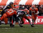
I think the revised athletic mark (basically the traditional mark with an outline and thickness) is good. I understand what you are saying Nathan about not showing up well on tv, but the traditional mark was hollow and didn't have any depth. Look at the helmet at the top of this page, they put that white inside the head to give it some depth and I had always wondered why that falcon head was only ever used by the football team.
The revised athletic mark gets my vote.
But as Fulch says the new one grows on me and like Nathan says I don't expect it to ever replace our beloved traditional head.
The revised athletic mark gets my vote.
But as Fulch says the new one grows on me and like Nathan says I don't expect it to ever replace our beloved traditional head.
all bowling green
-
Rightupinthere
- Mercenary of Churlishness
- Posts: 6549
- Joined: Fri Jul 23, 2004 7:53 am
- Location: Ye Olde Pigeon Hole
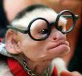
I despise the new logo. It reminds me of this guy:
www.unc.edu/~fiser/Space_Ghost/space.ghost.html
www.unc.edu/~fiser/Space_Ghost/space.ghost.html
"Science doesn’t know everything? Well science KNOWS it doesn’t know everything… otherwise it’d stop."
Dara O'Brian - Comedian
Dara O'Brian - Comedian
-
Falcon30
- Tubist / Human SubWoofer
- Posts: 2613
- Joined: Sat Jul 24, 2004 2:52 pm
- Location: South Amherst, Ohio
Mark - it really does look like space ghost.
I like the 'new' logo. I like that there was some effort made to introduce another look to Falcon Athletics.
I think the whole idea was misguided to a point. They tried to update the falcon head, and were limited in the type of design they could use. They had to use a profile shot with a very similar shape...I think they did a great job in making something out of that.
However, I think we needed a second logo identity apart from the falcon head. now we have two falcon heads. What do we do with two??? We should have done a completely different logo. A full body falcon? Something with talons? I don't have that answer, but I know having two falcon heads just won't do.
Inventor of the Clusterf**k and Shoot offense.


Well as I always say, beating a dead hourse doesn't get you anyplace any faster, and just makes a bigger mess.dstubb wrote:ok...ok...I know I'm beating a dead horse...sorry...just like the old helmet so much better...
.
NWLB
*********************************
http://www.CruiseAficionados.com - A Community for Cruise Fans. (Try the mobile app "Cruise Aficionados)
*********************************
http://www.CruiseAficionados.com - A Community for Cruise Fans. (Try the mobile app "Cruise Aficionados)
-
Schadenfreude
- Professional tractor puller
- Posts: 6983
- Joined: Fri Jul 23, 2004 7:39 am
- Location: Colorado

I liked the old logo better than the revised one. I respect what they were trying to do, but it isn't as sleek. Also, I continue to miss the white splotch on our helmets.
But the retail mark continues to grow on me. Personally, I hope they throw it on our helmets next year. It's a good logo and it will look infinitely better on television than what we have now.
But the retail mark continues to grow on me. Personally, I hope they throw it on our helmets next year. It's a good logo and it will look infinitely better on television than what we have now.
