Rollo83 wrote:
Can someone explain the Miami Hurricane helmet symbol to me?
I"ve wondered about that "U" for a long, long time. . .
I've heard it said it is an international/weather map symbol for hurricane, or something.
It ain't cool.
This is what I found under at Miami's website:
In 1973, UM’s Athletic Federation, the fund raising arm of the athletic department at the time, commissioned a local public relations expert to develop a distinctive logo. The University had gone several years with a variety of helmet and uniform changes and the Federation noted that a number of major colleges have the initials UM. Miami designer Bill Bodenhamer suggested the "U" idea, which lent itself to slogans like "U gotta believe" and "U is great".
Too bad they didn't also decide to change the name of the school at the time since there was another Miami that had been around much longer.
In 1973, UM’s Athletic Federation, the fund raising arm of the athletic department at the time, commissioned a local public relations expert to develop a distinctive logo. The University had gone several years with a variety of helmet and uniform changes and the Federation noted that a number of major colleges have the initials UM. Miami designer Bill Bodenhamer suggested the "U" idea, which lent itself to slogans like "U gotta believe" and "U is great".
BGSU Falconz wrote:I recreated a few of the known variations to see what they look like. Obviously, the middle one is the current helmet.
OK switch the brown on the logo with white on the first example, and I agree that the 'new' logo should be outlined in white.
The first one would look like 2003's helmet updated. Also, when you look at the helmet from the side, the stripes on the top make sense (Brown edge outlined in white)
I like the current design (middle pic) best of all.
If we were to removed the stripes from the helmet, then my opinion may change. It would change for the worse since it would only remind me of the old Bengles helmet.
"Science doesn’t know everything? Well science KNOWS it doesn’t know everything… otherwise it’d stop."
Dara O'Brian - Comedian
The design is thicker on this page than on the helmet. I believe they were trying to get a "large" design versus a "solid" design (Television viewing probably played into the equation). If they would use bolder lines with a more compact design, I think it would be a more pronounced logo.
"Science doesn’t know everything? Well science KNOWS it doesn’t know everything… otherwise it’d stop."
Dara O'Brian - Comedian
I also think the brown on the actual helmets is not as dark as say the brown on the helmet stripes.
Something to think about, the stripes on the helmet seem a bit out of place since we no longer have the traditional stripes on the arms or stripes up the pant legs. SHould they modify the stripes to match the "tooth" on the pant legs? Or would we look too much like the Broncos.
OK, first the current helmets have got to go. They look great as long as you're 5 ft. away from the player, but from the back of the stadium, or on TV you can't see the logos at all.
On to the uniforms...
I love the current home uniforms, but the all white away uniforms are just bad. I LOVE the brown, with orange sides design that was drawn up, and I really don't care for the brown usually. I mean, you want to talk about unique, all brown (with some orange) would be it.
Uniforms...I agree with your assessment. The all white is bad and an all brown with orange accents sounds good to me. That all white is missing something, but I don't know how they can make it better.
Helmets...I like the sample shown with the brown in the center. The one with the white is too confusing and does not look like a falcon. Too many people did not have a clue what the heck it was.
Actually, I think we need two set of helmets. Orange ones for at home with the orange unis and white ones for on the road to go with the white unis. Teams/Schools spend so much money on uniforms, but no one that I know of has more than one helmet that they use on a consistent basis. (Yes the NFL teams do the throw-back thing, but that is just once a year.) We could be on the leading edge of the next marketing scheme!
"An intelligent man is sometimes forced to be drunk to spend time with his fools."
- Ernest Hemingway
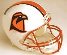
Dayons_Den wrote:A quick mock up of a white helmet with a "tooth" stripe thing to match the pants more- it narrows in the back
The more I look at this the more I am kind of warming up to it. .. . I really like the orange facemask.
Hmmmm.......
I really do like that. It's got an old school look, or kinda like the Colts' helmets.
As to why teams haven't come out with two helmets...Its because the general public doesn't go out and buy helmets, as they buy jerseys. If people often baught one helmet, they'd be willing to buy two; but they don't. Just like everything else in the world, it all boils down to the Allmighty Dollar.