Page 1 of 2
2010 Hockey Face-Off Reception!!!
Posted: Thu Sep 09, 2010 5:57 pm
by Falcon Fanatic
Mailings for this will be going out soon, but was asked to get this posted to let the fans know about this upcoming event!
2010 Hockey Face-Off Reception!!
Wednesday, September 29, 2010 @ 5:30
Hockey Alumni Room
North End
BGSU Ice Arena
Tickets:
Falcon Club Members $15
Non-Members $20
Children 12 and under $5
Tickets Includes:
-Pictures & Autographs after the program
-Hors d'oeuvres served by celebrity waiters (read: hockey players!)
-Refreshments (soda & water)
Business Casual Attire
Respond NO LATER than September 27
Send Remittance to:
BGSU Athletics Department
Sebo Athletic Department
1610 Stadium Dr.
Bowling Green, Ohio 43403-0030
Make Checks payable to:
BGSU Foundation, Inc.
Questions? Call: 419-372-2401
Re: 2010 Hockey Face-Off Reception!!!
Posted: Wed Sep 29, 2010 7:18 am
by Falcon Fanatic
REMINDER, if you didn't read the other thread...
Hockey Face Off Reception starts at 5:30, not 7, as was indicated in the letter that came with the season tickets!
4 DAYS TO THE START THE BERGERON ERA!!
GO FALCONS!!!
Re: 2010 Hockey Face-Off Reception!!!
Posted: Wed Sep 29, 2010 10:28 pm
by Falcon Fanatic
Face Off Reception Gets Hockey Fans Hyped
http://www.bgsufalcons.com/news/2010/9/ ... 00717.aspx
It was nice to meet some of the new guys. Every freshman I talked with said how much they LOVED it here!!!

The coach had the freshman sing Ay Ziggy Zoomba!! AWESOME!!!
3 Days, 17 Hours, 31 Min, 55 Sec!! HURRY UP ALREADY!!!!
Re: 2010 Hockey Face-Off Reception!!!
Posted: Thu Sep 30, 2010 12:29 pm
by Dayons_Den
Does anyone have any pictures of the new sweaters?
Has anyone seen them yet?
Re: 2010 Hockey Face-Off Reception!!!
Posted: Thu Sep 30, 2010 2:30 pm
by falcons86
I was talking to Max Grover last night and asked him about the new sweaters. He went over and asked Scooter, and basically, they aren't ready yet. So, I guess I wouldn't be surprised if they wear last years sweaters on Sunday.
Jim and Cookie
GO FALCONS!
NEVER GIVE UP!
NEVER SURRENDER!
Re: 2010 Hockey Face-Off Reception!!!
Posted: Thu Sep 30, 2010 3:46 pm
by Tricky_Falcon
New hockey sweater revealed.
http://tinyurl.com/3ax5ttl
Re: 2010 Hockey Face-Off Reception!!!
Posted: Thu Sep 30, 2010 4:03 pm
by rood
Well...
I didn't really care for the overlapping BG on the previous white home jerseys so I guess this is an improvement although I never liked having the little numbers on the front of other teams jerseys and I don't really like them here either.
I also think that wearing the dark jerseys at home and every visiting team wearing white is boring. Same look on the ice night after night, week after week. I like the variety of the visiting teams to look different from each other.
Wish they had pics of the new brown jerseys.
Re: 2010 Hockey Face-Off Reception!!!
Posted: Thu Sep 30, 2010 4:56 pm
by falcons86
I love 'em!! We hit a homerun on these as far as I'm concerned. I like the tie-downs in front. Nice job folks!! Classic, clean look. And I freakin' love the fact that we get to wear the browns at home!
Jim and Cookie
GO FALCONS!
NEVER GIVE UP!
NEVER SURRENDER!
Re: 2010 Hockey Face-Off Reception!!!
Posted: Thu Sep 30, 2010 5:23 pm
by MACMAN
ah yes the "offical Miami Red Hawk copy logo" not the real Falcon logo...but that horse has been beaten to death, several times...and yet they just dont get it...
Re: 2010 Hockey Face-Off Reception!!!
Posted: Thu Sep 30, 2010 6:00 pm
by BGFalconfromCincy
MACMAN wrote:ah yes the "offical Miami Red Hawk copy logo" not the real Falcon logo...but that horse has been beaten to death, several times...and yet they just dont get it...
](/img/ayziggyzoomba/58/58/54314911ff35ed959956620e68458f73.gif "Brick wall")
Whats not to get, it doesn't look like their redhawk, its bascially a filled in version of the old logo. I guess being from Cincy and having to see that Miami logo so much I don't see what others see. That is the official logo right now and is going to be on all new uniforms for all sports until we change our logo again.
Re: 2010 Hockey Face-Off Reception!!!
Posted: Thu Sep 30, 2010 6:04 pm
by toddpav
MACMAN wrote:ah yes the "offical Miami Red Hawk copy logo" not the real Falcon logo...but that horse has been beaten to death, several times...and yet they just dont get it...
I really have no idea what you're talking about.
Re: 2010 Hockey Face-Off Reception!!!
Posted: Thu Sep 30, 2010 7:27 pm
by Dayons_Den
Not a fan of the numbers on the front of hockey jerseys, but overall I like the design. The nameplates look odd too, but again, overall ok. They should do what many minor leagues do- where either dark or light at home until new years then at the new year wear the other at home. Would increase sales of both sets of jerseys and allow your home fans to see both of your sets and multiple sets of the opposition.
As to the logo, I can't think of another "updating" of a logo that was pulled off so well. And our logo is 2-Dimensional while MU's is 3-dimensional...

Re: 2010 Hockey Face-Off Reception!!!
Posted: Thu Sep 30, 2010 10:16 pm
by MACMAN
I am a traditionalist, not a revisionist, it was perfect before and now, its a modified red hawk.
Of course I respect your position as well, but there was no need what so ever to change the logo, and the falcon brand.
I do however I like the more of a return than not in the team gear.
I think it will blend well the play of old with the new play, and overall excitement around this program.
Re: 2010 Hockey Face-Off Reception!!!
Posted: Thu Sep 30, 2010 10:34 pm
by Falcon Fanatic
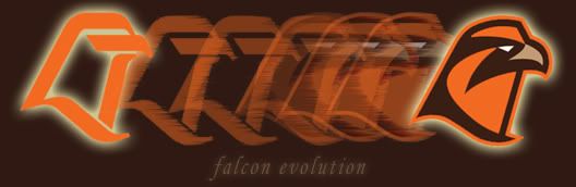
I really like the blending of the old and new! I like that they are using the basic '84 design to tie into our successful past and I like it that they are adding a little bit of new stuff to make it unique for THIS TEAM! This is the team that is launching the new era of Falcon Hockey!!! This is the team that turns the program in the right direction to BRING BACK THE GLORY!!!
FALCON HOCKEY FOREVER!!!
Re: 2010 Hockey Face-Off Reception!!!
Posted: Fri Oct 01, 2010 9:40 am
by Drago
I think the white ones are really bad. If you are going to go "throwback" then go "throwback." They are a combination of really plain and busy with the numbers on the front and patches on the sleaves. The brown ones look like they have legitimate potential with the exception of the orange pants. We'll see I guess, but I was expecting a better look than the white ones.