Page 1 of 2
KSU re-cap - Logo
Posted: Wed Feb 21, 2007 8:35 am
by Falcon30
http://sports.espn.go.com/ncw/recap?gameId=270512309
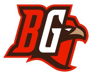
Here is the re-cap of the KSU game. I have to admit I feel a real sense of pride when I see our logo. It is better than anyone else in the MAC.
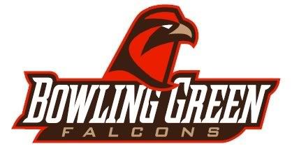
Look at it - When I was watching the NIU game on FoxSports, they had a scoreboard show after the game and they had this logo:
It looked better than NIU's side-by-side...I know this seems stupid to some of you, but I felt proud. Not like beaming pride, but I felt proud to have a better looking logo than anyone else. It hit me again this morning when I read the re-cap.
Posted: Wed Feb 21, 2007 8:39 am
by Jacobs4Heisman
I love the retail logo, but hate the peek-a-boo format. Personally, I cringe everytime I see that on ESPN.
The retail logo by itself is sweet as Hell. I wish they'd just use that.
Posted: Wed Feb 21, 2007 8:58 am
by Warthog
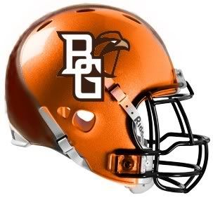
I have noticed that the peek-a-boo BG logo has been showing up more and more. Seems like the University must be encouraging its use. Or do you think ESPN gets to pick which logo to use? Either way, I like this representation. It gives you the simple fact that it is Bowling Green (BG) and incorporates the retail logo. I like it, especially on a football helmet.

Posted: Wed Feb 21, 2007 9:20 am
by Falcon30
Jacobs4Heisman wrote:I love the retail logo, but hate the peek-a-boo format. Personally, I cringe everytime I see that on ESPN.
The retail logo by itself is sweet as Hell. I wish they'd just use that.
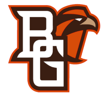
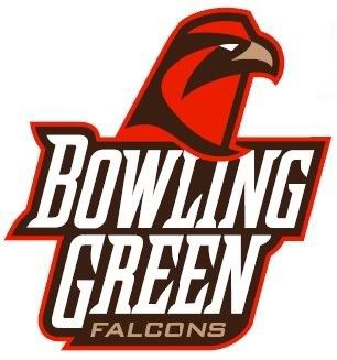
Like the retail logo, but I admit I like the BG in the logo above as well.
This is the "peek a boo" logo I dislike strongly:
Posted: Wed Feb 21, 2007 9:21 am
by Schadenfreude
Jacobs4Heisman wrote:I love the retail logo, but hate the peek-a-boo format. Personally, I cringe everytime I see that on ESPN.
The retail logo by itself is sweet as Hell. I wish they'd just use that.
+ 1.
That said, I guess for television, the interlocking BG is helpful so people know what university is being talked about.
That thing should be kept away from our helmets, though. The retail logo is more impressive without text.
Posted: Wed Feb 21, 2007 9:23 am
by Falcon30
Warthog wrote:I have noticed that the peek-a-boo BG logo has been showing up more and more. Seems like the University must be encouraging its use. Or do you think ESPN gets to pick which logo to use? Either way, I like this representation. It gives you the simple fact that it is Bowling Green (BG) and incorporates the retail logo. I like it, especially on a football helmet.
did someone say "on a football helmet?"
Posted: Wed Feb 21, 2007 9:25 am
by Falcon30
Gotta admit - on a helmet it should be either or - letters or falcon head...not both.
So how bout that Amber Flynn!!! Carin Horne sure is good!
Posted: Wed Feb 21, 2007 9:31 am
by Jacobs4Heisman
Falcon30 wrote:Jacobs4Heisman wrote:I love the retail logo, but hate the peek-a-boo format. Personally, I cringe everytime I see that on ESPN.
The retail logo by itself is sweet as Hell. I wish they'd just use that.
Like the retail logo, but I admit I like the BG in the logo above as well.
This is the "peek a boo" logo I dislike strongly:
Yeah -- that's one's pretty bad too.
I think what I dislike about the one ESPN is using, is that the Falcon head is so small compared to the BG. It seems unbalanced to me.
If we like having the school name mentioned along with the logo while it's still new, I would like if we spelled out Bowling Green in the new font and had the retail logo above it.
Posted: Wed Feb 21, 2007 9:51 am
by Falcon30
I just looked at all there-caps, and compared our logo side-by-side...it looks better than anyone else's.
Ranking MAC logos:
1. BGSU - Originality, the school name and mascot all in it. Unique colors, mascot, letters.

2. Akron - cool blue and gold colors, not cartoony.

3. NIU - A little 'modern' for my tastes, but nice to look at...nice font

4. Ohio - not as hanna-barbara as some logos; nice mix of text and graphic

5. WMU - the original of the new wave of MAC makeovers.

6. Miami - very cartoonish - the lumpy hawk nose is distracting. They should use the cool "M"

7. Kent - A bird head with lightning neck and no body?

8. Buffalo - love the color, but it looks like one of those generic logos on an EA Sports video game.

9. Toledo - this version sucks - actually Toledo has a quite nice stylized rocket with that simple font. Their logo is one of the cleanest and best in the MAC. Would be top 5 if they had their normal logo.

10. Ball State - Dated, angular, flying into the ground.

11. CMU - Dated, too angular, need lines behind it to convey motion.

12. EMU - What is with that eagle? - come up with something befitting DI athletics.

Posted: Wed Feb 21, 2007 9:51 am
by Warthog
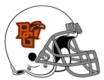
Falcon30 wrote:did someone say "on a football helmet?"
A white helmet
And make the '"BG" orange instead of white.
Posted: Wed Feb 21, 2007 9:55 am
by Falcon30
Jacobs4Heisman wrote:Falcon30 wrote:Jacobs4Heisman wrote:I love the retail logo, but hate the peek-a-boo format. Personally, I cringe everytime I see that on ESPN.
The retail logo by itself is sweet as Hell. I wish they'd just use that.
Like the retail logo, but I admit I like the BG in the logo above as well.
This is the "peek a boo" logo I dislike strongly:
Yeah -- that's one's pretty bad too.
I think what I dislike about the one ESPN is using, is that the Falcon head is so small compared to the BG. It seems unbalanced to me.
If we like having the school name mentioned along with the logo while it's still new, I would like if we spelled out Bowling Green in the new font and had the retail logo above it.
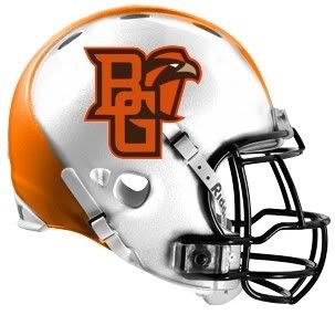
I agree - like this:
or This:
Posted: Wed Feb 21, 2007 9:57 am
by Jacobs4Heisman
The second one is sweet. That's exactly what I had in mind. I really like that font.
Posted: Wed Feb 21, 2007 10:04 am
by redskins4ever
Miami uses the M... they use it everywhere except for the ALternate Hockey Jersey and the hockey logo underneath the ice.
I don't own any clothes with anything other than the word Miami on it.
Posted: Wed Feb 21, 2007 10:49 am
by Falcon30
Jacobs4Heisman wrote:The second one is sweet. That's exactly what I had in mind. I really like that font.
I 'borrowed' it from the official release a few years ago about the new identity.
Posted: Wed Feb 21, 2007 10:55 am
by Falcon30
Warthog wrote:Falcon30 wrote:did someone say "on a football helmet?"
A white helmet
And make the '"BG" orange instead of white.
Can anyone make this pertinent to BGSU basketball?
Kate Achter sure is FAST!