
BINGO!1987alum wrote:Bleeding Orange wrote:
Logo
-
Rightupinthere
- Mercenary of Churlishness

- Posts: 6549
- Joined: Fri Jul 23, 2004 7:53 am
- Location: Ye Olde Pigeon Hole

-
MACMAN
The only difference is the BGSU Falcon characature looks like it was made by some one with my artistic abilites.Bleeding Orange wrote:I'll have to disagree with you on your second statement, but I will wholeheartedly agree with your first. I have long thought that the retail logo is a fitting and well-done evolution of our "classic" logo. I really don't understand how people equate the Miami and BG logos. They're both birds, but beyond that, well...Schadenfreude wrote:The logos aren't really that close. Our new retail logo is a much more abstract take on a bird -- which I think keeps with the spirit of the older logo.mk455 wrote:may look similar to miami's logo... but still, from a graphic design standpoint, the new one is much more pleasing to the eye.
(i found the logo i was looking for by the way)
I think they did a whale of a job with the retail logo. It's timeless -- and I'm not sure that applies to the old logo, cherished though it is.
** - at this point I was going to post a side-by-side comparison of the BG and Miami logos, but (and I think this is because of the incomprehensible aversion to the new mark) I had a hell of a time trying to find a .pdf of our logo anywhere on the web. I mean - it is non-existent in any kind of search! So, I decided to dig through this site's archives to find something, and I stumbled upon one of Schad's posts from July of 2004 that stated what I had intended to say much more clearly and succinctly than I could have ever dreamed of. So, my friends, I give - Schadenfreude (uncensored):
These are my thoughts:
First, I agree with NWLB said about the process. Krebs, J.D. and others handled this superbly.
Second, they got most of this right. They embraced our wonderfully distinctive colors rather than hiding from them. And they came up with a great new font. It is contemporary, it is bold and I think it will age well.
Now, on the new retail mark:
I LOVE it! I do. This is no small furry animal. It is astract, just like our old logo was. I'd argue this new logo is really just a three-dimensional rendering of our traditional two-dimensional logo.
Also, I disagree with those who think the retail logo somehow apes what they have at Miami. Not at all. It is pretty clear to me that we came to this independently.
Look at the differences:
Their logo is far more realistic. Look at the beak. Look at the eyes.
I like what we came up with better.
In fact... if they want to throw it on the helmets in '05... that would be fine with me.
I think most of us are going to get used to this in a hurry.
It would bother me if I thought we were tinkering with the logo just to do it -- because that would mean we might have to adjust to another logo in a couple of years.
It's hard to argue that's the case. Look at all the work that went into crafting that new logo, I'm thinking we are going to stick with what the committee came up with for a long time.
And, with that in mind, I don't mind switching. This new logo is probably better than what we have now.
Now I wouldn't argue everything is perfect.
I understand why they retooled the traditional logo, to set up an evolution to the retail logo. But, artistically, that extra blob of color takes it a step backward in my mind. I wouldn't want that extra blob of color marring up our helmets, for instance.
The only real disaster I see are these interlocking BGs I see in the .pdf file:
http://www.fansonly.com/photos/schools/ ... /logos.pdf
Those look like crap.
But most of this is very, very good stuff.
The original was fine and athseticly pleasing, this new modern crap ass s**t blob has no soul, or heritage.
Keepo it off our sports gear, keep it off my ice, keep it off our helmets,
get out
go away
shoo.


It's actually big M, little e, little b. "Montreal Expos Baseball". Or at least that's the explanation I had always heard.Warthog wrote:I never got the Expos logo. I always thought it was a cursive e-l-b.
That or it's an abbreviation for a French phrase meaning "30,000 empty seats".
"I don't believe I can name a coach, anywhere, anytime, anyhow, who did it better than Doyt Perry."
-1955 BG Assistant Bo Schembechler
BGSUsports.com - Where ESPN.com goes for BG history.
-1955 BG Assistant Bo Schembechler
BGSUsports.com - Where ESPN.com goes for BG history.


-
Schadenfreude
- Professional tractor puller
- Posts: 6983
- Joined: Fri Jul 23, 2004 7:39 am
- Location: Colorado

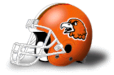
If the Helmet Project is accurate, then the traditional Falcon logo first appeared on a Bowling Green football helmet (in white, with an orange center) in 1970 and only lasted that season.RobbyFalcon wrote:I started at BG in Jan. '86 and I think what is now affectionately called the "Traditional Falcon" was new.
It returned (in brown, with a white center) in 1981 and remained unchanged until Gregg Brandon had the white center removed last season.
That's why I figure the logo came about around the time the Expos got their start.
An enterprising AZZ.com reader could confirm the logo was used in 1970. I know there are BG News readers here who probably have easy access to the 1970-71 year book. Yank it out and check out the football section.
(And, here's a bonus assignment: Scan the photo of fans holding up a sign from the Kent State football game and upload it. I think people here would get a kick out of that).
Incidentally, I apologize that some of those links I posted earlier went dead. I had posted an Expos logo, the Astros uniform, and a couple of World Football League photos.
I got the logos from this site:
http://www.sportslogos.net/league.php?l=23
And it's a really cool site.
-
Schadenfreude
- Professional tractor puller
- Posts: 6983
- Joined: Fri Jul 23, 2004 7:39 am
- Location: Colorado

I think that it predates even the Expos. According to a friend and 1960s FMB member, the logo was designed by a trumpet player in the FMB in the early 60s, using only a caligraphy pen. He can't remember the guy's name, though.Schadenfreude wrote:That's why I figure the logo came about around the time the Expos got their start.RobbyFalcon wrote:I started at BG in Jan. '86 and I think what is now affectionately called the "Traditional Falcon" was new.

-
Bleeding Orange
- The Abominable Desert 'Cat
- Posts: 7065
- Joined: Sun Sep 19, 2004 8:06 pm
- Location: Searching for a home, via Chicago...
- Contact:
Actually, upon reviewing our old helmets, I say screw all of our current logos. All of 'em. Done.
We need to bring back the angry chicken from 1978.
We need to bring back the angry chicken from 1978.
From the halls of ivy...
It is not my intention to do away with government. It is rather to make it work - work with us, not over us; stand by our side, not ride on our back. Government can and must provide opportunity, not smother it; foster productivity, not stifle it. ~Ronald Reagan


It is not my intention to do away with government. It is rather to make it work - work with us, not over us; stand by our side, not ride on our back. Government can and must provide opportunity, not smother it; foster productivity, not stifle it. ~Ronald Reagan
-
Dayons_Den
- aka Joe Bair's Lair
- Posts: 5015
- Joined: Fri Jul 23, 2004 2:58 pm
- Location: Baseball Grounds of Jacksonville
- Contact:
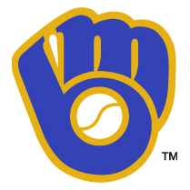
This season the Brewers actually brought back a retro-esque alternate uniform that features the ball in glove logo.Schadenfreude wrote:Me, too. I bet they bring it back some day.Warthog wrote:Well, I still don't like the Expos logo. I always thought the Brewers with the M and B forming a glove was clever.
Sunday Retro Jersey:

all bowling green
-
Dayons_Den
- aka Joe Bair's Lair
- Posts: 5015
- Joined: Fri Jul 23, 2004 2:58 pm
- Location: Baseball Grounds of Jacksonville
- Contact:
As a design geek I can definitely say I am very happy with the "update" the traditional logo got:

I love the old logo, the traditional logo, but it was inconsistant, and didn't have depth and the football helmet was the only place the white center appeared. I think the above logo is a great "update" to our great logo.
I have warmed up to the retail space ghost logo, but I am certainly glad they diddn't ditch our beloved L-T falcon head.
all bowling green
-
Schadenfreude
- Professional tractor puller
- Posts: 6983
- Joined: Fri Jul 23, 2004 7:39 am
- Location: Colorado
-
Falconfreak90
- Rubber City Falcon
- Posts: 18542
- Joined: Fri Jul 23, 2004 9:28 am
- Location: Green, OH
- Contact:
DD,Dayons_Den wrote:As a design geek I can definitely say I am very happy with the "update" the traditional logo got:
I love the old logo, the traditional logo, but it was inconsistant, and didn't have depth and the football helmet was the only place the white center appeared. I think the above logo is a great "update" to our great logo.
I have warmed up to the retail space ghost logo, but I am certainly glad they diddn't ditch our beloved L-T falcon head.
I guess I am starting to come around to the new retail logo as well. I'm not crazy about it but I won't go out of my way to buy anything with it....except one of those director tailgate chairs.
The new update to the traditional logo looks awesome. I love that one and the added outline gives it much more depth.
75 days, 2 hours and 7 min.
Michael W.
BGSU-12 TIME MAC CHAMPION
FALCON FOOTBALL ROCKS!
BGSU-12 TIME MAC CHAMPION
FALCON FOOTBALL ROCKS!

