Rightupinthere wrote:The primary complaint about our current helmets...
I don't sense a lot of complaining about our helmets.
It is true that our current logo is a little difficult to discern from a distance. But we aren't alone here.
Southern California's logo is really just a blob, for example. The Texas logo, while decent, isn't easy to make out from the stands.
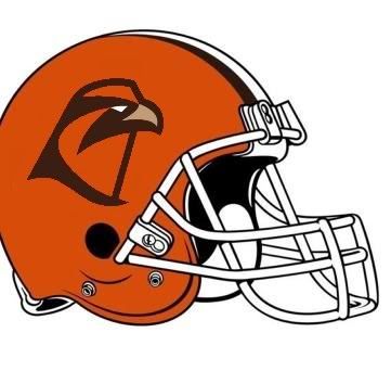
In my view, our retail logo, outlined in white, would be a major improvement if visibility from the stands is the issue.
Moreover, I harbor a sense that many universities that have opted to put text on their helmets do so either for historical reasons or because they have few other options.
In the latter case, i would point to:
-- Central Michigan's: CMU is in a bit of a spot with it's "Chippewas" nickname and will have to probably stick with lettering for the foreseeable future.
-- Illinois: See Central Michigan
-- Stanford. "Cardinal" is a color. I suppose they could stick a tree on the helmets, but they have not as of yet. Part of the problem, I assume, is that trees are usually green.
-- North Texas. See Stanford.
-- Indiana. It would be interesting to know what a "Hoosier" looks like, but it appears boosters in our neighbor to the west are daunted by that particular artistic challenge.
I would further submit that lettering is frequently inferior to a damned good logo -- and that this is equally true in our case.
To my eyes, the script "UCLA" is crap. Pittsburgh will eventually junk it's latest "Pitt" lettering, because it's nothing special. Baylor's "BU" is a missed opportunity. The helmets of the Sun Belt look like an ugly high school term paper.
There are exceptions, of course. I've always believed Northern Illinois made a mistake in junking it's bold, interlocking "NI" in favor of that mutt. Oregon's "O" is a work of art (as are those uniforms, in my view).
Still, those are exceptions.
Our interlocking "BG" isn't bad. But either logo -- the traditional logo or the retail logo -- are better in my view.
I guess to reiterate my view: I believe our retail logo is a work of genius, one of the best logos in collegiate sports, and a mark that would earn an NFL team millions of dollars in profits. It is a marked improvement on our charished traditional mark.
But our traditional mark has quite a few years behind it. If we stick with what we have, that's fine with me.
If we change, I think we should go straight to the retail logo.
The challenge is making it work on a helmet. The white outline is one approach. A white helmet is another.
I think I prefer the former approach, because our hats have always been orange.