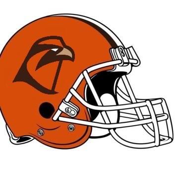
new helmet mock up

Discussion of the Falcon football team.
User avatar
always a falcon
Peregrine
Peregrine
Posts: 1193
Joined: Mon Sep 06, 2004 7:04 pm

Post by always a falcon »

TG1996 wrote:
jeebus wrote: and younger fans, who could possibly become our new omars and joshes, dont give much of a damn about the history of our old falcon
Cue Penn State. Old School. Plain, dont' give a damn about that fancy stuff. Have always loved them. But I am older than dirt AND Falcon Fanatic.*she ducks*

"Younger fans don't give a damn." It is YOUR job, and OUR job to make sure that they DO give a damn. And the Joshes and Omars like the offense we run/ran. We could be running it in Polka Dot uniforms and if we were putting up 400 air yards a game, oh they would come! Oh and the team not sucking would help.

RUIT- you are correct. All the money was spent on Space Ghost, because the tv nitwits could not figure out our Falcon Outline as our mascot. So obviously, if you spend a lot of money on it, it has to be great.....sigh

I do like the BG on the helmet. And many of the other designs put forth. Very creative guys. Anyone forwarding them on to the powers that be?
Falcons4Life
Peregrine
Peregrine
Posts: 635
Joined: Mon Nov 22, 2004 9:51 pm
Location: Lawrence, Kansas

Post by Falcons4Life »

NO BG ON THE HELMET...

Every school in the country has letters as their logo....screw that
I love my birds! Go Falcons, Go Jayhawks!!!
User avatar
jeebus
Chick
Chick
Posts: 254
Joined: Sat Dec 30, 2006 10:20 am
Location: piqua/bgsu ohio

Post by jeebus »

we arent penn state. we dont have the same dynasty as penn state. so that arguement isnt really valid...penn state has much more exposure then we do and more storied a history in the public eye. thats why they get away with it.

now, by younger fans i mean children. before they get offers. if younger fans like a style of play...well we have a similar one to most mac schools...high octaine offense and the like. to get casual viewers, especially children interested who dont know our tradition we need to be eye grabbing. of course we are fond of the tradition...we know it. tradition means nothing if nobody knows it. i could invent a holiday and celebrate it yearly but if i made a tv special about it people would still say "what the heck is this?" we need the flash. the new logo was made to be marketable...we need to market ourselves with it.

its all fine and good to change things to appease the fans and their love of our tradition but if we want people who dont know us to fall in love with falcon football...well we need to catch their eye..we need to branch out. i know that many of you will use the same arguements to this post as they do to any idea of change. but then they'll also complain later about how osu has more fans and how we dont have the attendance we should... osu markets itself, as do all the big schools. some even change their logos and what not to be current and it seems to work for them.
hey everyone! i'm a moron!
User avatar
TG1996
Peregrine
Peregrine
Posts: 12708
Joined: Fri Jul 23, 2004 3:27 am
Location: Indianapolis
Contact:

Post by TG1996 »

Falcon30 wrote:I guess I don't think changing our uniform changes our tradition and history.
Not entirely, but the whole tone of the post I replied to gave off a feeling of "damn the past, I want an Oompa Loompa NOW, Daddy!" And I hadn't thought of it before, but the helmet being OUR helmet means a lot more than I had realized, and affects me more than changing the rest of the uniform, for some reason (although I still think we should go back to the 80's-90's version and stick with it. :D
"I don't believe I can name a coach, anywhere, anytime, anyhow, who did it better than Doyt Perry."
-1955 BG Assistant Bo Schembechler

BGSUsports.com - Where ESPN.com goes for BG history.
User avatar
jeebus
Chick
Chick
Posts: 254
Joined: Sat Dec 30, 2006 10:20 am
Location: piqua/bgsu ohio

Post by jeebus »

i agree there, dont change the basic helmet design...just put the retail on it....it doesnt ruin anything. of all the logos we've had (i know some people like it but the falcon/giraffe hybrid.... falaffe henceforth was a whole heck of alot worse)
hey everyone! i'm a moron!
User avatar
Bleeding Orange
The Abominable Desert 'Cat
Posts: 7065
Joined: Sun Sep 19, 2004 8:06 pm
Location: Searching for a home, via Chicago...
Contact:

Post by Bleeding Orange »

Falcon30 wrote: I guess I don't think changing our uniform changes our tradition and history.
Bleeding Orange wrote:Perhaps it is the historian in me that makes me have this preservationist reaction to something that, I'm sure to a lot of you folks, may seem minuscule. Still, I am of the opinion that if we change everything, and hold on to nothing, it becomes increasingly more difficult to hold on to our past.
I don't agree with your premise that our helmet is a component of our "uniform." The term "uniform," to me, reflects the tailorable, fabric-based components of a team's physical coverings. In football terms, again - to me - a helmet is not a part of that image. And by saying this, I mean that a football team's helmet design is, in my opinion, much less flexible than it's uniform design. For example, although I dig the hell out of the uniform design that our Falcons have donned over the past two years, it is clear to me that the design was not intended to reflect our traditional brown/white striped helmet design. This is indicated to me by the clamoring for a helmet alteration (in terms of the stripe) to reflect the new tooth-like design on the pants of this particular style - again, Louisville-esque. In my opinion, this is a point of view that has been reached via a backwards thought process. It is not the fabric that provides identity guidance, it is the helmet. After all, fabric is a much more fluid artistic media than a plastic helmet is. That is, unless we want football helmets to turn into the free-form artistic statements that goalie helmets are in hockey. Someone could have that opinion, I don't know.

I can totally respect Hammb's desire to keep the white field in the middle of the logo on the helmets. Personally, I find the difference between the "filled-in" and "empty" logos to be pretty much a wash, but that is just me, and I am pretty much a noob, to boot. Young as I may be, I still have an immense ammount of respect for tradition. I don't think it is too much to expect my temporal peers to feel this same way. A motto that I wish every institution would abide by: Respect what we have, change what we must."
From the halls of ivy...

It is not my intention to do away with government. It is rather to make it work - work with us, not over us; stand by our side, not ride on our back. Government can and must provide opportunity, not smother it; foster productivity, not stifle it. ~Ronald Reagan

Image

:smt117
User avatar
Falcon Fanatic
Peregrine
Peregrine
Posts: 6798
Joined: Thu Jul 22, 2004 11:23 pm
Location: BG

Post by Falcon Fanatic »

always a falcon wrote: But I am older than dirt AND Falcon Fanatic.*she ducks*
You really need to stop hanging around TG, it's bad for your mental health! :-D
"Regarding BGSU, I would think their biggest strength is that they never give up, They never slow down and they battle hard even after the other team scores. We have to be on our game and never, ever take the foot off the gas for a second."
~~USCHO Poster
"BG was relentless. It's like they know that a good first pass on the breakout from a defenseman will almost always result in an odd-man rush against them - but they go in anyway and dare you to make that pass. All three of their goals were just grit and effort. That's a team any fan can be proud to support...they give all they've got."
~~USCHO Poster, AFTER Tech beat us
#NeverGiveUp
#NeverSurrender
#Relentless
#Resiliant
User avatar
Schadenfreude
Professional tractor puller
Posts: 6983
Joined: Fri Jul 23, 2004 7:39 am
Location: Colorado

Post by Schadenfreude »

Rightupinthere wrote:The primary complaint about our current helmets...
I don't sense a lot of complaining about our helmets.

It is true that our current logo is a little difficult to discern from a distance. But we aren't alone here.

Southern California's logo is really just a blob, for example. The Texas logo, while decent, isn't easy to make out from the stands.

In my view, our retail logo, outlined in white, would be a major improvement if visibility from the stands is the issue.

Moreover, I harbor a sense that many universities that have opted to put text on their helmets do so either for historical reasons or because they have few other options.

In the latter case, i would point to:

-- Central Michigan's: CMU is in a bit of a spot with it's "Chippewas" nickname and will have to probably stick with lettering for the foreseeable future.
-- Illinois: See Central Michigan
-- Stanford. "Cardinal" is a color. I suppose they could stick a tree on the helmets, but they have not as of yet. Part of the problem, I assume, is that trees are usually green.
-- North Texas. See Stanford.
-- Indiana. It would be interesting to know what a "Hoosier" looks like, but it appears boosters in our neighbor to the west are daunted by that particular artistic challenge.

I would further submit that lettering is frequently inferior to a damned good logo -- and that this is equally true in our case.

To my eyes, the script "UCLA" is crap. Pittsburgh will eventually junk it's latest "Pitt" lettering, because it's nothing special. Baylor's "BU" is a missed opportunity. The helmets of the Sun Belt look like an ugly high school term paper.

There are exceptions, of course. I've always believed Northern Illinois made a mistake in junking it's bold, interlocking "NI" in favor of that mutt. Oregon's "O" is a work of art (as are those uniforms, in my view).

Still, those are exceptions.

Our interlocking "BG" isn't bad. But either logo -- the traditional logo or the retail logo -- are better in my view.

I guess to reiterate my view: I believe our retail logo is a work of genius, one of the best logos in collegiate sports, and a mark that would earn an NFL team millions of dollars in profits. It is a marked improvement on our charished traditional mark.

But our traditional mark has quite a few years behind it. If we stick with what we have, that's fine with me.

If we change, I think we should go straight to the retail logo.

The challenge is making it work on a helmet. The white outline is one approach. A white helmet is another.

I think I prefer the former approach, because our hats have always been orange.
User avatar
Dayons_Den
aka Joe Bair's Lair
aka Joe Bair's Lair
Posts: 5015
Joined: Fri Jul 23, 2004 2:58 pm
Location: Baseball Grounds of Jacksonville
Contact:

Post by Dayons_Den »

Well said Schad. You make many good points on the schools with letters and I like your analysis of our situation with the BG, the retail logo, and the fact that using our current helmet would be ok.

As far as other team analysis, look at Boise State. They try to do the logo and the words BOISE STATE when the Bronco head alone would be sufficient.
all bowling green
User avatar
TG1996
Peregrine
Peregrine
Posts: 12708
Joined: Fri Jul 23, 2004 3:27 am
Location: Indianapolis
Contact:

Post by TG1996 »

Schadenfreude wrote: -- Indiana. It would be interesting to know what a "Hoosier" looks like, but it appears boosters in our neighbor to the west are daunted by that particular artistic challenge.
Image

I don't know if this would be visible from the stands. :lol:
"I don't believe I can name a coach, anywhere, anytime, anyhow, who did it better than Doyt Perry."
-1955 BG Assistant Bo Schembechler

BGSUsports.com - Where ESPN.com goes for BG history.
User avatar
Falcon52
Fledgling
Fledgling
Posts: 489
Joined: Fri Jul 23, 2004 8:07 am
Location: 6'1" - 255lbs

Post by Falcon52 »

I like NIU's helmet. CMU's helmets are bad. They should go with a feather or have the local reservation provide some ideas, that way the NCAA doesn't get all hot and bothered.

Anyone from Indiana is a Hoosier, so that picture above will do just fine. or they could assign some random animal like the Georgetown Hoyas with that bulldog. They are unrelated.
User avatar
Rightupinthere
Mercenary of Churlishness
Posts: 6549
Joined: Fri Jul 23, 2004 7:53 am
Location: Ye Olde Pigeon Hole

Post by Rightupinthere »

Schadenfreude wrote: I guess to reiterate my view: I believe our retail logo is a work of genius, one of the best logos in collegiate sports, and a mark that would earn an NFL team millions of dollars in profits. It is a marked improvement on our charished traditional mark.

But our traditional mark has quite a few years behind it. If we stick with what we have, that's fine with me.
As is no secret on this, you and I will agree to disagree. The update to the traditional was done pretty well. I don't believe the recent logo NEEDED refreshing. It's timeless (speaking as a marketing person).

But, if we're going to just do a mass update, let's not just fiddle fart around. None of this "do a little here and a little there." We'll have uniforms fitting of Michael Jackson's face.

If we are going to use the new logo it just CANNOT be on an orange helmet. My marketing professional is going to speak out on this. It looks awful even with the white outline. There NEEDS to be a contrasting logo on the helmet field. The new logo works best on a white or brown helmet.

I like the BG with falcon heads on the arms. But, it's a matter of taste.

All in all, however, I would rather have the old helmet with the traditional horizontal stripes on the sleeves and pants. I wouldn't mind the mock-ups DD put forth a couple of years ago. THOSE were awesome.

This has been a fun thread, however. We have some very good creative minds here.
"Science doesn’t know everything? Well science KNOWS it doesn’t know everything… otherwise it’d stop."
Dara O'Brian - Comedian
User avatar
jeebus
Chick
Chick
Posts: 254
Joined: Sat Dec 30, 2006 10:20 am
Location: piqua/bgsu ohio

Post by jeebus »

i'm still disagreeing... having "traditional" style jersey's would be a bad idea. white or brown helmets would almost be worse...and i just plain dont like the BG on the helmets.
hey everyone! i'm a moron!
User avatar
Falcon30
Tubist / Human SubWoofer
Posts: 2613
Joined: Sat Jul 24, 2004 2:52 pm
Location: South Amherst, Ohio

Post by Falcon30 »

Rightupinthere wrote:
Schadenfreude wrote: I guess to reiterate my view: I believe our retail logo is a work of genius, one of the best logos in collegiate sports, and a mark that would earn an NFL team millions of dollars in profits. It is a marked improvement on our charished traditional mark.

But our traditional mark has quite a few years behind it. If we stick with what we have, that's fine with me.
As is no secret on this, you and I will agree to disagree. The update to the traditional was done pretty well. I don't believe the recent logo NEEDED refreshing. It's timeless (speaking as a marketing person).

But, if we're going to just do a mass update, let's not just fiddle fart around. None of this "do a little here and a little there." We'll have uniforms fitting of Michael Jackson's face.

If we are going to use the new logo it just CANNOT be on an orange helmet. My marketing professional is going to speak out on this. It looks awful even with the white outline. There NEEDS to be a contrasting logo on the helmet field. The new logo works best on a white or brown helmet.

I like the BG with falcon heads on the arms. But, it's a matter of taste.

All in all, however, I would rather have the old helmet with the traditional horizontal stripes on the sleeves and pants. I wouldn't mind the mock-ups DD put forth a couple of years ago. THOSE were awesome.

This has been a fun thread, however. We have some very good creative minds here.
This has been fun - I like seeing different ideas and hearing opinions. I might not agree, but it is fun to think about.

I have to vehemently disagree that the 'retail' falcon would look bad on an orange helmet. I really want to re-post pics, but just look at my avatar. It's a smaller pic with the new logo on it. If the shading wasn't so heavy on the pic, it would be clearly visible.

No outline is necessary.

Shoot - how many logos that aren't letters are identifiable from the stands or on TV? It is an overblown concern. No outline at all - it's good.

Image
Inventor of the Clusterf**k and Shoot offense.
User avatar
jeebus
Chick
Chick
Posts: 254
Joined: Sat Dec 30, 2006 10:20 am
Location: piqua/bgsu ohio

Post by jeebus »

i agree...preserves our helmet, updates the logo... i think the visibility concerns are just a way to shoot down the retail logo.
hey everyone! i'm a moron!
Post Reply