I just looked at all there-caps, and compared our logo side-by-side...it looks better than anyone else's.
Ranking MAC logos:
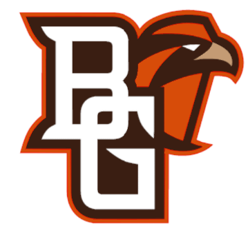
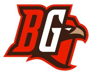
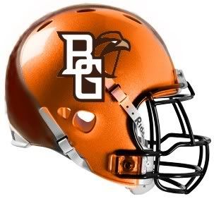
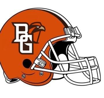
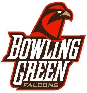
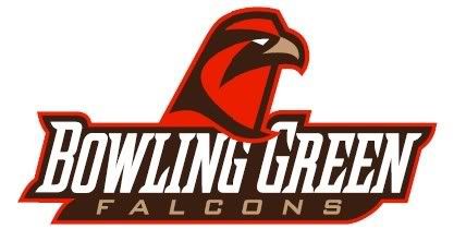
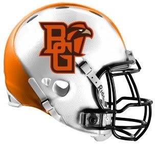
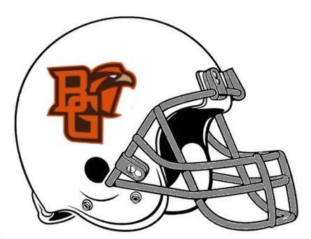
1. BGSU - Originality, the school name and mascot all in it. Unique colors, mascot, letters.

2. Akron - cool blue and gold colors, not cartoony.

3. NIU - A little 'modern' for my tastes, but nice to look at...nice font

4. Ohio - not as hanna-barbara as some logos; nice mix of text and graphic

5. WMU - the original of the new wave of MAC makeovers.

6. Miami - very cartoonish - the lumpy hawk nose is distracting. They should use the cool "M"

7. Kent - A bird head with lightning neck and no body?

8. Buffalo - love the color, but it looks like one of those generic logos on an EA Sports video game.

9. Toledo - this version sucks - actually Toledo has a quite nice stylized rocket with that simple font. Their logo is one of the cleanest and best in the MAC. Would be top 5 if they had their normal logo.

10. Ball State - Dated, angular, flying into the ground.

11. CMU - Dated, too angular, need lines behind it to convey motion.

12. EMU - What is with that eagle? - come up with something befitting DI athletics.

Inventor of the Clusterf**k and Shoot offense.