I like the new helmet....

-
eRichFalcon
- Fledgling

- Posts: 346
- Joined: Sat Jan 27, 2007 8:19 pm
- Location: Perrysburg/Bowling Green

I concur. But since you mentioned it, just think about how much nicer our new helmets would look with some Boise St. Bronco Blue paint worn off from a hard fought battle at the Doyt.ZuluWarrior wrote:I actually think this helmet debate was put forth by the athletic department because they were tired of hearing about how putrid this years schedule is.
(that's a hard fought battle)
Finally a senior!
-
Schadenfreude
- Professional tractor puller

- Posts: 6983
- Joined: Fri Jul 23, 2004 7:39 am
- Location: Colorado

-
Tricky_Falcon
- Peregrine

- Posts: 2984
- Joined: Thu Jul 22, 2004 11:23 pm
- Location: The State of Bowling Green
Back to the Burnt Orange debate. I wish the university would actually use that color. A lot of the time what the univ. sells is pumpkin orange or orange like you see on hunters gear. I aquired several orange shirts through the athletic dept give aways and SBX while I was in college and all the shirts are a different shade of orange.

For comparison's sake, here is the logo that was released in August of 2005:
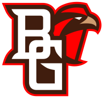
Here is the logo that was released for the t-shirt contest (re-sized):
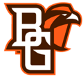
Here is the logo that was released for the t-shirt contest (re-sized):
Check out our new BGSU hockey site: http://www.bgsuhockey.com
-
Falcon30
- Tubist / Human SubWoofer
- Posts: 2613
- Joined: Sat Jul 24, 2004 2:52 pm
- Location: South Amherst, Ohio

That top one looks so red, it is hideous.BGDrew wrote:For comparison's sake, here is the logo that was released in August of 2005:
Here is the logo that was released for the t-shirt contest (re-sized):
Wasn't there a logo page somewhere that had the exact shade of orange for BG? like Pantone #3945y94534tw4 for BG orange????
Inventor of the Clusterf**k and Shoot offense.
-
Falcon30
- Tubist / Human SubWoofer
- Posts: 2613
- Joined: Sat Jul 24, 2004 2:52 pm
- Location: South Amherst, Ohio
Rightupinthere wrote:Not bad. I would have to see the whole uni to get a better impression.
I liked this mock-up from Falcon30 a little more than this design.
Someday, maybe even someday soon, someone is going to utilize the 'new' shape of the revolution helmet (which I am told will eventually replace all Riddell helmets) in their design...too bad it isn't BG.
Inventor of the Clusterf**k and Shoot offense.
http://www.bgsu.edu/offices/mc/gsm/page14943.htmlFalcon30 wrote:That top one looks so red, it is hideous.
Wasn't there a logo page somewhere that had the exact shade of orange for BG? like Pantone #3945y94534tw4 for BG orange????
Check out our new BGSU hockey site: http://www.bgsuhockey.com
-
Falconfreak90
- Rubber City Falcon
- Posts: 18541
- Joined: Fri Jul 23, 2004 9:28 am
- Location: Green, OH
- Contact:
Great point, Drew. Having "BG" as part of the logo makes perfect sense. I didn't want the old logo put out to pasture but let's face it...we all knew it was going to happen. I knew it would happen when GC told me twice as many people were buying the retail logo gear. If that means more revenue for the school, so be it. Just win the damn MAC TITLE!!!!!BGDrew wrote:I hate to break this to everyone, but the logo switch isn't because it "looks better."
The interlocking BG with the "peek-a-boo" Falcon is being used to make our symbol more identifiable. Our logo is actually the perfect one when you consider that you name the whole school in one logo (Bowling Green Falcons).
The use of the interlocking BG with the Falcon will really help especially when talking about things such as ESPN coverage.
I love the interlocking BG...love it. EVERYONE knows who "BG" is....Get the season started now.
GO FALCONS!!
Michael W.
BGSU-12 TIME MAC CHAMPION
FALCON FOOTBALL ROCKS!
BGSU-12 TIME MAC CHAMPION
FALCON FOOTBALL ROCKS!
-
Falconfreak90
- Rubber City Falcon
- Posts: 18541
- Joined: Fri Jul 23, 2004 9:28 am
- Location: Green, OH
- Contact:
Hammb,hammb wrote: You could tattoo it on your leg (Freak). out the traditional logo to what I think are vastly inferior "NEW" logos. The worst part is you can bet your ass this logo change is done for the exact same reason as every other logo change in history: to spur merchandise sales.
I guess that just means a new tattoo. LOL! To spur mechandise sales...correct. If that means I see more BG gear all over the state and more people wearing BG gear as opposed to those Gator Bitches in Columbus, especially on the BG campus, I'm for it. Everyone here knows how badly we need the funds. We're not stupid. GC was brought in to raise revenue and run the AD with that revenue.
I loved the grass field. I will always love that traditional logo. Things change and I can't control a whole lot. I just support every team at BG that wears the Orange and Brown...no matter what the unis look like. It's the student-athletes that matter, not what they wear.
Honestly? I can't wait to see the new unis at the Doyt with the new turf and Sebo Center opening. I don't care about the opposition that day. I figure our team will already be pissed off about losing to Temple last year...or they better be!!! Let's see what this all looks like!
Michael W.
BGSU-12 TIME MAC CHAMPION
FALCON FOOTBALL ROCKS!
BGSU-12 TIME MAC CHAMPION
FALCON FOOTBALL ROCKS!
-
Falcon Fanatic
- Peregrine
- Posts: 6798
- Joined: Thu Jul 22, 2004 11:23 pm
- Location: BG
When I heard they were working on new/updated logos and I saw the drawings that were presented to the athletic department, the person who showed them to me told me the following: "Don't worry, they're not getting rid of the traditional logo! They will still have that, they just outlined it to make it stand out better and that bird...that's for retail merchandise ONLY...all athletic department stuff will still have the traditional logo on it!!"Falconfreak90 wrote: I knew it would happen when GC told me twice as many people were buying the retail logo gear.
Ok...so the retail bird is selling better? WELL DUH!!!!!!!!!!!!!!!!
"Regarding BGSU, I would think their biggest strength is that they never give up, They never slow down and they battle hard even after the other team scores. We have to be on our game and never, ever take the foot off the gas for a second."
~~USCHO Poster
"BG was relentless. It's like they know that a good first pass on the breakout from a defenseman will almost always result in an odd-man rush against them - but they go in anyway and dare you to make that pass. All three of their goals were just grit and effort. That's a team any fan can be proud to support...they give all they've got."
~~USCHO Poster, AFTER Tech beat us
#NeverGiveUp
#NeverSurrender
#Relentless
#Resiliant

I am overwhelmingly pleased to hear this. For months I have laboured under a ghastly and gruesome misapprehension that all traces of the traditional logo would vanish, like a serial lothario who shamelessly absconds into the inky night after nurturing the hopes and desires of his yet unknowing victim in pursuit of his own selfish greed.....all athletic department stuff will still have the traditional logo on it!!"
Better still, this news scothes any possibility of an argument about the very graphics that are so integral to the fabric of this site!