

Answers questions about the coaches' shows, the logo(s) and the turf.
Check it out!!
http://bgsufalcons.cstv.com/genrel/072507aab.html
New Ask the AD up 7/25/07
-
ZiggyZoomba
- The Wizard of AZZ

- Posts: 5916
- Joined: Sun Apr 11, 2004 5:37 pm
- Location: Elmore, OH
New Ask the AD up 7/25/07
Grant Cummings
ROLL ALONG!!!
"We are linked to this institution by invisible bonds that do not wither or dissolve." --BGSU President, Dr. Ralph W. McDonald - 1968
ROLL ALONG!!!
"We are linked to this institution by invisible bonds that do not wither or dissolve." --BGSU President, Dr. Ralph W. McDonald - 1968


Bummer. Buy up the old logo stuff now is what I got out of that.
Personally, I see no problem with having a retail logo and a separate logo that is actually worn by the team. This is done throughout sports and has not caused an issue previously.
Now what we're going to see is a complete abolishing of the traditional logo in the favor of the retail one. The only saving grace I can see is that I prefer the peek-a-boo version to the retail logo by itself.
I still think all variations of the new logo are crap compared to the "LT" version, but they didn't ask me.
And imagine that... the "new" logo came at some expense to a graphics design/research/BS company, and the one that lasted 30+ years showed up in an art class (allegedly).hammb wrote:I still think all variations of the new logo are crap compared to the "LT" version, but they didn't ask me.
*sigh* Poor LT...
"I don't believe I can name a coach, anywhere, anytime, anyhow, who did it better than Doyt Perry."
-1955 BG Assistant Bo Schembechler
BGSUsports.com - Where ESPN.com goes for BG history.
-1955 BG Assistant Bo Schembechler
BGSUsports.com - Where ESPN.com goes for BG history.
-
ZiggyZoomba
- The Wizard of AZZ
- Posts: 5916
- Joined: Sun Apr 11, 2004 5:37 pm
- Location: Elmore, OH
Maybe in 3 or 4 years we'll see a "retro" line of clothing sporting the "LT" Falcon??hammb wrote:Bummer. Buy up the old logo stuff now is what I got out of that.
Personally, I see no problem with having a retail logo and a separate logo that is actually worn by the team. This is done throughout sports and has not caused an issue previously.
Now what we're going to see is a complete abolishing of the traditional logo in the favor of the retail one. The only saving grace I can see is that I prefer the peek-a-boo version to the retail logo by itself.
I still think all variations of the new logo are crap compared to the "LT" version, but they didn't ask me.
Grant Cummings
ROLL ALONG!!!
"We are linked to this institution by invisible bonds that do not wither or dissolve." --BGSU President, Dr. Ralph W. McDonald - 1968
ROLL ALONG!!!
"We are linked to this institution by invisible bonds that do not wither or dissolve." --BGSU President, Dr. Ralph W. McDonald - 1968

-
MACMAN
-
FalconTurf
- Peregrine

- Posts: 1491
- Joined: Sun May 20, 2007 9:37 pm
Correct me if I'm wrong on this interpretation:
1. The LT falcon is trademarked by the University.
2. The new falcon logo and font is trademarked by the athletic department.
3. The BGSU seal is no longer in use by the University for some reason?
It would seem reasonable to me that the athletic department will use the new logo while the University may continue to market with the old logo since the seal is rarely if ever used anymore.
I proudly chose to be a Falcon and a Falcon I will remain until the end.
-
Flipper
- The Global Village Idiot

- Posts: 18397
- Joined: Fri Jul 23, 2004 1:01 am
- Location: Ida Twp, MI
I know...I feel so ....dirty1987alum wrote:Flipper, are you suggesting *gasp* copyright infringement?Flipper wrote:Guys...calm down...in this day of internets and home graphics design packages you can downlos the "LT" and make your own "custom" BG wear.
It's not the fall that hurts...it's when you hit the ground.

My understanding is that there was some sort of a contest in the early 60s, and a trumpet player from the band "designed" it using a calligraphy pen.TG1996 wrote:And imagine that... the "new" logo came at some expense to a graphics design/research/BS company, and the one that lasted 30+ years showed up in an art class (allegedly).
*sigh* Poor LT...

-
Falconfreak90
- Rubber City Falcon
- Posts: 18542
- Joined: Fri Jul 23, 2004 9:28 am
- Location: Green, OH
- Contact:
Why not just use the "Repost Same Post" button for each thread? Seriously. How about a new tradition of finding SOMETHING positive to say for once?MACMAN wrote:this guys a total rock.
KEEP THE FONT and the Bowling Green
but restore the REAL BIRD and save the TRADITION
the redhawk knock off is what is gay and kills it.
I also love his new tradition of keeping criminals on the teams...thats class.
Talk about total rocks...grow a pair.
Michael W.
BGSU-12 TIME MAC CHAMPION
FALCON FOOTBALL ROCKS!
BGSU-12 TIME MAC CHAMPION
FALCON FOOTBALL ROCKS!
-
ZuluWarrior
- Peregrine
- Posts: 1056
- Joined: Tue Oct 26, 2004 9:19 pm
- Location: Born and Raised in The D! Indoctrinated in BG! Living Near Chicago

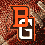
First off, for one who has knocked GC about a number of issues 'my view' is he is right on target with regard to logo and marks. To have three different logos on different uniforms is about as I-AA as you can get. Of course there will be those who don't like change and I can respect that. And my biggest gripe is that it is a knock-off of the Redskins new logo. However, along with the font it does look sharp.
On another note of support, there were many here who thought tradition meant grass, even after the deplorable and less than high school condition game agains said Redskins. However, the new field looks absolutely first class, very impressive and I think the athletic department has done a great job getting that done.
On another note of support, there were many here who thought tradition meant grass, even after the deplorable and less than high school condition game agains said Redskins. However, the new field looks absolutely first class, very impressive and I think the athletic department has done a great job getting that done.

While I still don't love the new logo, it is growing on me since I can now see what it looks like at thirty some feet wide. Something GC said about needing to unify the school with one logo made me think of this in a total communist russia sort of way; if you disagree with the new logo, it is almost like you are going against BGSU and we can call the BGKGB and they'll make your azz disappear after they torture you to find out who your cohorts are.
Yeah right girl!
Oorah!
Oorah!
