New Helmets

Discussion of the Falcon football team.
User avatar
Schadenfreude
Professional tractor puller
Posts: 6983
Joined: Fri Jul 23, 2004 7:39 am
Location: Colorado

Post by Schadenfreude »

hammb wrote:
eRichFalcon wrote:And once again, we're comparing Bowling Green to the most storied schools in the history of college football, exactly what myself and others scolded MACMAN for. I would love it if we could be a part of that list, but it just isn't the case.

And we didn't change for the sake of change. The reasoning is addressed in July 25's "Ask the AD". Whether you agree with his reasonings or not, to say that the change was made for the sake of change is just plain inaccurate.
Disagree.

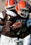
He stated that the reason was to unite the university & athletics under one logo.

There is absolutely no reason whatsoever why it could not have been the traditional logo.
Here's one reason: The new logo is simply better.

It is.

If we were starting the university from scratch, and the two logos were the finalists in some sort of contest, there is no way on God's green earth that we would be choosing the traditional logo.

It was great while it lasted, but it's time to change. This new logo is flat out better. It might last 100 years. The one we had was never going to last that long. It was showing its age.
User avatar
Rightupinthere
Mercenary of Churlishness
Posts: 6549
Joined: Fri Jul 23, 2004 7:53 am
Location: Ye Olde Pigeon Hole

Post by Rightupinthere »

Schadenfreude wrote: If we were starting the university from scratch, and the two logos were the finalists in some sort of contest, there is no way on God's green earth that we would be choosing the traditional logo.
I agree with this and it's is why I haven't completely "bought in" to the new logo. I don't like the idea of starting over. By starting over, I mean that BG was getting recognition and notoriety with the current "simple" logo. Changing takes a step back - however little or great that step was. Instead of viewing the logo change from a purely sexual angle, I'm viewing it from a business perspective.

But, I know I can't fight fashion - even though I'm wearing Chuckie high tops with shorts right now. I favor the peak-a-boo over the new logo solo (like hammb).
Schadenfreude wrote:The one we had was never going to last that long. It was showing its age.
I'm sorry, brother, but I just don't agree that it was showing any sort of age. The simplicity of the logo made it timeless. Think GE, Chevy, Ford, Detroit Lions, New York Yankees, etc. Yes, I'm equating BG with those examples.

I do like the "BG" on the helmet. It would have been awesome with the traditional on the shoulders. Again, not fighting fashion just stating my favor.
"Science doesn’t know everything? Well science KNOWS it doesn’t know everything… otherwise it’d stop."
Dara O'Brian - Comedian
User avatar
Dayons_Den
aka Joe Bair's Lair
aka Joe Bair's Lair
Posts: 5015
Joined: Fri Jul 23, 2004 2:58 pm
Location: Baseball Grounds of Jacksonville
Contact:

Post by Dayons_Den »

Rightupinthere wrote:Changing takes a step back - however little or great that step was. Instead of viewing the logo change from a purely sexual angle, I'm viewing it from a business perspective.

Don't all the figures show a dramatic increase in revenue from the new logo?
all bowling green
User avatar
Rightupinthere
Mercenary of Churlishness
Posts: 6549
Joined: Fri Jul 23, 2004 7:53 am
Location: Ye Olde Pigeon Hole

Post by Rightupinthere »

Dayons_Den wrote:
Rightupinthere wrote:Changing takes a step back - however little or great that step was. Instead of viewing the logo change from a purely sexual angle, I'm viewing it from a business perspective.

Don't all the figures show a dramatic increase in revenue from the new logo?
I have not seen said number. Can you share?
"Science doesn’t know everything? Well science KNOWS it doesn’t know everything… otherwise it’d stop."
Dara O'Brian - Comedian
User avatar
Rightupinthere
Mercenary of Churlishness
Posts: 6549
Joined: Fri Jul 23, 2004 7:53 am
Location: Ye Olde Pigeon Hole

Post by Rightupinthere »

I don't want to say "rip-off" but one has to wonder.

http://ucfathletics.cstv.com/genrel/050407abn.html

Eyes, font, shading. All familiar, yes?
"Science doesn’t know everything? Well science KNOWS it doesn’t know everything… otherwise it’d stop."
Dara O'Brian - Comedian
User avatar
BGSU Crazy Fan 58
Fledgling
Fledgling
Posts: 303
Joined: Fri Dec 03, 2004 9:16 pm
Location: BGSU

Post by BGSU Crazy Fan 58 »

Rightupinthere wrote:I don't want to say "rip-off" but one has to wonder.

http://ucfathletics.cstv.com/genrel/050407abn.html

Eyes, font, shading. All familiar, yes?
Well the fomer director of marketing here at BG, Jason Horn, is now the assitant athletic director at UCF. So that may have something to do with it.
Roll Along You BG Warriors,
Roll Along and Win for BGSU!!!

"We’ve addressed that with recruiting kids to that level. If you come to Bowling Green, you’re going to compete for a championship,” Coach Greg Brandon
User avatar
Dayons_Den
aka Joe Bair's Lair
aka Joe Bair's Lair
Posts: 5015
Joined: Fri Jul 23, 2004 2:58 pm
Location: Baseball Grounds of Jacksonville
Contact:

Post by Dayons_Den »

The new UCF logos and font are a result of a five-month collaborative effort between various offices within the University, Collegiate Licensing Company (CLC) and Rickabaugh Graphics, Inc.
The link is the design company, not middle management at UCF.

a sampling of their work reveals somewhat of a common theme:

Image
Image
Image

**edited to note that Rickabaugh Graphics DID NOT design the Miami University Redhawks logo.**
all bowling green
User avatar
TG1996
Peregrine
Peregrine
Posts: 12708
Joined: Fri Jul 23, 2004 3:27 am
Location: Indianapolis
Contact:

Post by TG1996 »

Dayons_Den wrote: a sampling of their work reveals somewhat of a common theme:

Image
Is this one the new Xavier logo? :wink:
"I don't believe I can name a coach, anywhere, anytime, anyhow, who did it better than Doyt Perry."
-1955 BG Assistant Bo Schembechler

BGSUsports.com - Where ESPN.com goes for BG history.
User avatar
Schadenfreude
Professional tractor puller
Posts: 6983
Joined: Fri Jul 23, 2004 7:39 am
Location: Colorado

Post by Schadenfreude »

TG1996 wrote:
Dayons_Den wrote: a sampling of their work reveals somewhat of a common theme:

Image
Is this one the new Xavier logo? :wink:
Ha!
User avatar
bgmaggot00
Peregrine
Peregrine
Posts: 1186
Joined: Sat Jul 24, 2004 1:38 am
Location: Lawrence, KS

Post by bgmaggot00 »

Apparently Xavier was going with the "Less is more" philosophy.
User avatar
hammb
The Stabber of Cherries
Posts: 14330
Joined: Fri Jul 23, 2004 8:21 am
Location: Bowling Green

Post by hammb »

Dayons_Den wrote:
Rightupinthere wrote:Changing takes a step back - however little or great that step was. Instead of viewing the logo change from a purely sexual angle, I'm viewing it from a business perspective.

Don't all the figures show a dramatic increase in revenue from the new logo?
I don't doubt they do. That is the case every time a team changes colors, jerseys, logos, whatever. People go out to buy the newest latest stuff.

Hell it's the #1 reason for logo changes...it spurs merchandise sales.

As for which logo is better if we had never had a logo? It may be better in your eyes Schad, but I really don't like it. The peekaboo style is better (mainly because I like the BG font), but I just do not like that logo. Not sure what it is about it, but I don't care for the look at all...I'm not overly well versed in BG history, but when I see all the various logos we've had in our history posted on here, I'd have to say I like every single one of them better than the current "space ghost" thing. It just looks bad to me.
User avatar
Dayons_Den
aka Joe Bair's Lair
aka Joe Bair's Lair
Posts: 5015
Joined: Fri Jul 23, 2004 2:58 pm
Location: Baseball Grounds of Jacksonville
Contact:

Post by Dayons_Den »

hammb wrote:
Dayons_Den wrote:
Rightupinthere wrote:Changing takes a step back - however little or great that step was. Instead of viewing the logo change from a purely sexual angle, I'm viewing it from a business perspective.

Don't all the figures show a dramatic increase in revenue from the new logo?
I don't doubt they do. That is the case every time a team changes colors, jerseys, logos, whatever. People go out to buy the newest latest stuff.

Hell it's the #1 reason for logo changes...it spurs merchandise sales.
I was just pointing out the irony that RIUT was viewing the logo change from a business angle and the most important figure in business is the bottom line. :D basically i was just being a smart ass.
all bowling green
User avatar
Rightupinthere
Mercenary of Churlishness
Posts: 6549
Joined: Fri Jul 23, 2004 7:53 am
Location: Ye Olde Pigeon Hole

Post by Rightupinthere »

Dayons_Den wrote:
hammb wrote:
Dayons_Den wrote:
Rightupinthere wrote:Changing takes a step back - however little or great that step was. Instead of viewing the logo change from a purely sexual angle, I'm viewing it from a business perspective.

Don't all the figures show a dramatic increase in revenue from the new logo?
I don't doubt they do. That is the case every time a team changes colors, jerseys, logos, whatever. People go out to buy the newest latest stuff.

Hell it's the #1 reason for logo changes...it spurs merchandise sales.
I was just pointing out the irony that RIUT was viewing the logo change from a business angle and the most important figure in business is the bottom line. :D basically i was just being a smart ass.
I simple lift in sales strictly because of a logo change is one thing; sacrificing brand recognition is another.

Secondly, I want to see the factual numbers of the increase in revenue due solely to the logo and not a continued lift from the recent successes of some of the athletic teams.

There is a saying we share at work: "In God we trust; all others provide data."
"Science doesn’t know everything? Well science KNOWS it doesn’t know everything… otherwise it’d stop."
Dara O'Brian - Comedian
User avatar
BGSUFootballFan
Peregrine
Peregrine
Posts: 1768
Joined: Sat Mar 26, 2005 8:43 pm
Location: West Lafayette, IN

Post by BGSUFootballFan »

I dont care for the new helmets either. I wish we would have gone with the new falcon head along with the BG on the helmets. I believe the logo I'm referring to is the same one thats at mid-field, if not then it should be in my opinion!
4th & 13 on PU 32yd line.. 56,000 fans up on their feet screaming, i held my breath the entire play trying to make as little noise as possible.. wouldnt u know Sharon would make the biggest touchdown catch in the history of BG Football, FALCON UP!
transfer2BGSU
Peregrine
Peregrine
Posts: 5829
Joined: Fri Jul 23, 2004 8:50 am
Location: Jed's, Myle's Pizza, Corner Grill

Post by transfer2BGSU »

I was over in the Athletic Department earlier today and had a chance to see a new helmet.

SURPISINGLY - I thought it looked pretty good with just the 'BG' and no Falcon logo.

Hmmmmm.......wonder when we'll see a new football helmet up for auction on eBay?
"The name on the front of the jersey is more important than the name on the back" -Herb Brooks
Post Reply