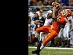
Did any of you see this in the BG News today. This is pretty cool. They have a nice article about his day at Kent State and a really cool graphic that breaks down his touches during the game.
I read the article in the BG News today while eating lunch at the Union. The graphic really was cool, they even color coded it orange and brown for the rushes and pass catches. Bonus +1 for that.
Let's just say that the Geter graphic was better than the pie graph they had on the front page for the 5th district Republican primary coming up. If you didn't see it, Bob Latta's 40% was taking up at least 2/3 of the circle!
24. Quality provider of the truth, for better or for worse.
Are you a math major? We were passing that chart around the grad office lounge laughing about it, and we figured not too many people beyond the math office would see the error.
Falconfreak90 wrote:That is really cool, Spart. I hope Geter tears up Ohio U this weekend. With OU trying to stop the run, the WR corps could have a field day.
GO FALCONS
Uh, believe me, OU doesn't do much to try to stop the run.
footballguy51 wrote:Are you a math major? We were passing that chart around the grad office lounge laughing about it, and we figured not too many people beyond the math office would see the error.
Another entertaining part of this chart, aside from the misscaled proportions of the pie and the fact that the numbers add up to <97%, is the fact that somehow there is an error of almost 6%.
Our guess is somebody was too lazy to go into microsoft excel and create a pie chart and instead downloaded this joke of a pie chart from the internet and filled in the blanks.
footballguy51 wrote:Are you a math major? We were passing that chart around the grad office lounge laughing about it, and we figured not too many people beyond the math office would see the error.
I'm actually an business major/accounting specialization, so technically no. But in accounting we are trained to look for stuff like that, misrepresentations and falsehoods, etc. I'm pretty good with numbers, statistics, and graphs until you get to calculus, then I'm pretty much worthless thereafter.
24. Quality provider of the truth, for better or for worse.
bgnewser wrote:Hey Mr. Partridge, thanks for posting my graphic. I worked pretty hard on it I'm glad you guys like it.
I'm also glad people on here find new and innovative ways to rip on The BG News. *fake laugh*
I didn't think it was all that inventive. It was a pretty obvious mistake, that a college newspaper should not have made. A 3rd grader knows how to do a pie chart. *fake laugh*