BGSU Falcons on the new logo/font
BGSU Falcons on the new logo/font
http://bgsufalcons.collegesports.com/ge ... 04aag.html
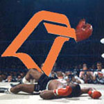
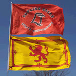
Paul Krebs and everyone involved with this project deserve alot of praise. I think the new font and revised logo are great. I'm not sold on the retail logo yet, but I'm sure I'll warm up to it in time.
Paul Krebs and everyone involved with this project deserve alot of praise. I think the new font and revised logo are great. I'm not sold on the retail logo yet, but I'm sure I'll warm up to it in time.
- orangeandbrown
- Peregrine

- Posts: 3542
- Joined: Mon Jul 26, 2004 5:00 pm
- Location: Saline, MI
- Contact:
-
CapitalFalcon
- Peregrine

- Posts: 3464
- Joined: Thu Jul 22, 2004 11:13 pm
- Location: Grosse Pointe, MI
I LIKE it!
I think they did a good job! I think it will be cool to have the "traditional" logo on all the athletic uniforms, and then have the "retail" logo also available! I think it adds and blends together nicely. Not cartoonish like the Blue Jays as we were worried and more in the spirit of the Atlanta Falcons. Krebs gets another atta boy!!!!! They didn't jack it up!!! 
- BGSU Falconz
- The Wizard of AZZ

- Posts: 596
- Joined: Sun Apr 11, 2004 10:44 pm
- Location: Dayton, Ohio
- Contact:
Praise worthy.
I think the revised traditional logo gives them a means to seperate offical sites, retail items, and such from non-offical. It reasserts the TM/CR, but leaves fudge room for folks like Grant to keep the existing logos without creating legal loop holes and things the legal types hate. Plus its easier to create patches for uniforms using the outlined logo.
The "new" logo head is very interesting. It is the first interpretation of the traditional logo I've seen which at once differs greatly, yet retains a clear tie to the original. It clearly is a transitional logo, I won't be surprised to see it grow in use over the years. I don't think for a second that isn't on the mind of those at the University. Yet the clear manner in which they have laid out the use of it is reassuring that a long-time tradition and icon to BGSU students past, present, and future, will not suddenly look out of place at any point by staying true to their favorite logo. Yet it also gives a formalized, offical alternative for retailers, coaches, and the few that simply don't especially like the logo.
What I very much appreciate is that it makes clear use of the colors. This was something they could well have used to put some space between the colors and their use. Instead, they reaffirm them.
This is a highly focused, structured, and sensitive effort by the University, and I agree, high praise is in order. This was the third rail of BGSU athletics. This was a razor like line they had to walk, they they did so exceptionally well. They haven't eliminated tradition, we added to it. They did not follow lock-step into the same silly changes we have seen at WMU or Ohio. They created a unique Bowling Green approach and result.
Above all else, it avoid the "Bug Splatt" style of UT's logo. And after all, isn't it always about doing everything better than anything UT can do!
- Dayons_Den
- aka Joe Bair's Lair

- Posts: 5015
- Joined: Fri Jul 23, 2004 2:58 pm
- Location: Baseball Grounds of Jacksonville
- Contact:
I didn't notice that at first. But yeah, ours almost looks like an italic version of the Miami with tighter kerning.I do really like the font and the falcon head with Bowling Green and Falcons underneath, but to me they are eerily similar to MIAMI with University underneath . . . . Let me know what you think:
-
CapitalFalcon
- Peregrine

- Posts: 3464
- Joined: Thu Jul 22, 2004 11:13 pm
- Location: Grosse Pointe, MI
Doesn't bother me. There are only so many things you can do with a school logo and text. If it went across the center, it might be very similar to Ohio State's Block O and "Ohio State" acorss the front or the Michigan M and "Michigan" across the front. I do think the new font with either BG or BGSU and the new Falcon peeking from behind is pretty cool.
Tighter kerning? WTF is that?McMetz811 wrote:I didn't notice that at first. But yeah, ours almost looks like an italic version of the Miami with tighter kerning.I do really like the font and the falcon head with Bowling Green and Falcons underneath, but to me they are eerily similar to MIAMI with University underneath . . . . Let me know what you think:
"An intelligent man is sometimes forced to be drunk to spend time with his fools."
- Ernest Hemingway
- Ernest Hemingway
- ZiggyZoomba
- The Wizard of AZZ

- Posts: 5916
- Joined: Sun Apr 11, 2004 5:37 pm
- Location: Elmore, OH
BGSUFalcons.com
I wonder how long it will take bgsufalcons.com to adopt the new scheme. They could do some pretty cool stuff with the logos and font...
There is a stylistic simularity to the Miami logo. However I think our logo has a more pure origin that is beyond being labeled as a copy-cat.
The Miami logo was in my view, rushed, due to the brush fire their administration was fighting about native Americans. The logo came into use amidst wide spread Alumni disgust, and the view that the University caved into political correctness. I don't dislike the logo as much now, but I still think it looks like it should be on the side of a KFC bucket. I will say that at the BG Mall there is a sharp looking leather jacket with a big redhawk logo on the back. Very sharp looking, and not something easy to do with their perfectly nice older logo.
Their logo, to me, will always have that taint of the debate over it.
At the very least, here in BG, nobody is protesting, no cars burning except on North Enterprise. And all the wreckage in streets is just left over from the heavy trash pickup.
I don't like how they reduce the logo as simply an athletic logo. To the vast majority of alumni to have attended BGSU, the Falcon logo is the one they have known. I appreciate it being codified as a standing part of the athletic establishment. I would hope the intent and future interpretation of the stated use of the logo secures it as a core tradition at BGSU.
Re: BGSUFalcons.com
Grant, you'll be able to say you started the trend here.ZiggyZoomba wrote:I wonder how long it will take bgsufalcons.com to adopt the new scheme. They could do some pretty cool stuff with the logos and font...


