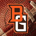
The new logo is up!!!!
Re: The new logo is up!!!!
All I can say is, "eh"
It's okay, could be worse. Doesn't really do much for me.
"I don't really like the secondary retail logo so much"
I agree, the second logo looks too much like the Miami Redhawk or Ball State Cardinal. The first logo is really cool though.
I agree, the second logo looks too much like the Miami Redhawk or Ball State Cardinal. The first logo is really cool though.
ROLL ALONG!!!!!
[email protected]
[email protected]
I definitely agree with that! I just told hammb I thought it looked like a flipped and two dimensional version of the redhawks. From what I read there, that one is only for licensed retailers to use on clothes. Maybe if the stuff doesn't sell, the logo will just fade away.I agree, the second logo looks toomuch like the Miami Redhawk or Ball State Cardinal. The first logo is really cool though.
- BGSU Falconz
- The Wizard of AZZ

- Posts: 596
- Joined: Sun Apr 11, 2004 10:44 pm
- Location: Dayton, Ohio
- Contact:
To quote myself on the other thread on this subject:
I don't care much for the outline around the traditional logo...too confusing..at least the brown head/orange outline version. The orange head/brown outline is alright.
The new logo is interesting. I think the traditional is a more solidly designed logo, though.
- rc_ziggy84
- Peregrine

- Posts: 656
- Joined: Sat Jul 24, 2004 12:06 am
- Location: Orlando, FL
- Rightupinthere
- Mercenary of Churlishness

- Posts: 6549
- Joined: Fri Jul 23, 2004 7:53 am
- Location: Ye Olde Pigeon Hole
I like the font. It sleek and very marketable. It should sell TONS of merchandise. My taste favors the font of the hockey jerseys, but that's because I'm getting a tad long in the tooth.
I like the color scheme of the old logo. It does mute it somewhat, but it's updated in a proper manner.
Now, on to the marketing logo: Yeah, it has a hint of the MU redskin logo but without the sexy Abercrombie & Fitch pi$$ed off head turn. I don't see the Ball U log in that too much at all.
But there's something I REALLY like about the new logo. It has a very similar sillouhette to the old logo. That in of itself is pretty unique. My hats off to the individual with that idea.
It needed to be done, in my opinion, to expand the merchandise offering to a variety of tastes. In that respect, I like it. I MAY purchase an article with that head on it, but I still favor (heavily) the old logo.
I like expanding the offering because I'm a free market kind of guy. Whatever sell more stuff overall can't be all that bad.
"Science doesn’t know everything? Well science KNOWS it doesn’t know everything… otherwise it’d stop."
Dara O'Brian - Comedian
Dara O'Brian - Comedian
BGSU Falconz wrote:I don't care much for the outline around the traditional logo...too confusing..at least the brown head/orange outline version. The orange head/brown outline is alright.
The new logo is interesting. I think the traditional is a more solidly designed logo, though.
I don't care too much for the secondary logo at all. The new primary logo is, as I said earlier, okay. It's not terrible, but I don't like it any better than the original, thus I see no reason to change. Obviously they didn't ask me.
I do really like the font, however. I also like your avatar Falconz. The combo of the font & the marketing logo looks pretty cool, even though I don't like that logo by itself too well.
- Falcon Fanatic
- Peregrine

- Posts: 6798
- Joined: Thu Jul 22, 2004 11:23 pm
- Location: BG
I think it was SPECIFICALLY designed that way. Take the current logo shape, fill it in with an "updated" bird picture/drawing. It makes the transition from the current logo to that one, much smoother, and less of a "sudden" change for fans. Had they said they were going to change the logo to something completely different (as they tried to do several years ago), the reaction from the fans and community would have been a total uproar (as it was back then). The company that designed this knew exactly what they were doing and probably have had a lot of experience in this area. They have done several pro logos as well.Rightupinthere wrote:But there's something I REALLY like about the new logo. It has a very similar sillouhette to the old logo. That in of itself is pretty unique. My hats off to the individual with that idea.
As I stated earlier, I think the current one will eventually be dropped 2-3 years down the road and replaced with the "retail" one. As new uniforms and athletic department clothing, etc, are ordered, I am sure they will put the new font and new logo on them too. 5-7 years from now you probably won't be able to see the old logo sold anywhere (except clearance and sale items) on anything new.
Just my thoughts on the matter, fwiw....
"Regarding BGSU, I would think their biggest strength is that they never give up, They never slow down and they battle hard even after the other team scores. We have to be on our game and never, ever take the foot off the gas for a second."
~~USCHO Poster
"BG was relentless. It's like they know that a good first pass on the breakout from a defenseman will almost always result in an odd-man rush against them - but they go in anyway and dare you to make that pass. All three of their goals were just grit and effort. That's a team any fan can be proud to support...they give all they've got."
~~USCHO Poster, AFTER Tech beat us
#NeverGiveUp
#NeverSurrender
#Relentless
#Resiliant
- Falconfreak90
- Rubber City Falcon

- Posts: 18498
- Joined: Fri Jul 23, 2004 9:28 am
- Location: Green, OH
- Contact:
I like both....Still like the original logo better. BUT, THE LOGOS ARE ORANGE AND BROWN!! DAMN STRAIGHT!! 
The secondary logo will look pretty cool on apparel. I'll bet the kids will eat it up. ANd it still has the original shape for the most part.
"Other secondary monograms include the words "Falcons", "BG" and "BGSU" have been developed in the new font."
If anything looks a bit like Miami, it's the words....that bit of a sharp edge looks a bit like Miami's. No big deal.
All in all, I'm pleased.
GO FALCONS!!! 22 days til we shock the BCS again.
Michael W.
BGSU-12 TIME MAC CHAMPION
FALCON FOOTBALL ROCKS!
BGSU-12 TIME MAC CHAMPION
FALCON FOOTBALL ROCKS!
- Falconfreak90
- Rubber City Falcon

- Posts: 18498
- Joined: Fri Jul 23, 2004 9:28 am
- Location: Green, OH
- Contact:
FF<Falcon Fanatic wrote:I think it was SPECIFICALLY designed that way. Take the current logo shape, fill it in with an "updated" bird picture/drawing. It makes the transition from the current logo to that one, much smoother, and less of a "sudden" change for fans. Had they said they were going to change the logo to something completely different (as they tried to do several years ago), the reaction from the fans and community would have been a total uproar (as it was back then). The company that designed this knew exactly what they were doing and probably have had a lot of experience in this area. They have done several pro logos as well.Rightupinthere wrote:But there's something I REALLY like about the new logo. It has a very similar sillouhette to the old logo. That in of itself is pretty unique. My hats off to the individual with that idea.
As I stated earlier, I think the current one will eventually be dropped 2-3 years down the road and replaced with the "retail" one. As new uniforms and athletic department clothing, etc, are ordered, I am sure they will put the new font and new logo on them too. 5-7 years from now you probably won't be able to see the old logo sold anywhere (except clearance and sale items) on anything new.
Just my thoughts on the matter, fwiw....
great post....I agree the original will probably be phased out. It's a new era for BG athletics and sometimes change just needs time. I'll just buy everything with both logos!
Besides, I have soooo many things with the original logo, I'll always have it around...including on the skin.
Michael W.
BGSU-12 TIME MAC CHAMPION
FALCON FOOTBALL ROCKS!
BGSU-12 TIME MAC CHAMPION
FALCON FOOTBALL ROCKS!
- Lord_Byron
- Minister of Silly Walks

- Posts: 2158
- Joined: Fri Jul 23, 2004 7:04 am
- Location: Rochester NY
I guess I'd better buy all my stuff in the next few years, because I'm never buying anything with the "retail logo" on it.Falcon Fanatic wrote:I am sure they will put the new font and new logo on them too. 5-7 years from now you probably won't be able to see the old logo sold anywhere (except clearance and sale items) on anything new.
Just my thoughts on the matter, fwiw....
BG '79
Twitter: @Vapid_Inanities
Twitter: @Vapid_Inanities

