Tulsa's Uniforms

Discussion of the Falcon football team.
User avatar
Falcon30
Tubist / Human SubWoofer
Posts: 2613
Joined: Sat Jul 24, 2004 2:52 pm
Location: South Amherst, Ohio

Tulsa's Uniforms

Post by Falcon30 »

Anyone else think the blue, gold, red, black and white color scheme is fugly?

Image

I know they have a good team, and it will be difficult to win. I respect the heck out of them.

But either have red as a color or don't. I just don't like the look at all. I really dislike the away jerseys

Image
Inventor of the Clusterf**k and Shoot offense.
User avatar
Falcon30
Tubist / Human SubWoofer
Posts: 2613
Joined: Sat Jul 24, 2004 2:52 pm
Location: South Amherst, Ohio

Post by Falcon30 »

Image
Away Unis
Inventor of the Clusterf**k and Shoot offense.
User avatar
jacojdm
Peregrine
Peregrine
Posts: 2275
Joined: Fri Jul 23, 2004 8:45 am
Location: cleveland
Contact:

Post by jacojdm »

The red seems entirely unnecessary.
That shade of blue with the gold looks nice.
User avatar
Dayons_Den
aka Joe Bair's Lair
aka Joe Bair's Lair
Posts: 5015
Joined: Fri Jul 23, 2004 2:58 pm
Location: Baseball Grounds of Jacksonville
Contact:

Post by Dayons_Den »

I think their colors are unique and I like how red and gold look together.

I also think it is dangerous when we have a unique scheme that others could easily dub "ugly" to start slinging mud. . . :wink:
all bowling green
User avatar
TG1996
Peregrine
Peregrine
Posts: 12708
Joined: Fri Jul 23, 2004 3:27 am
Location: Indianapolis
Contact:

Post by TG1996 »

Dayons_Den wrote:I think their colors are unique and I like how red and gold look together.
I agree. I think the red accent around the white and blue is very bold and pleasing to the eye. As far as I can tell, the black is very minimal, and apparently only really used in the hurricane flags on the pants. The red adds a nice touch to what would otherwise be a kind of plain blue and gold (though the royal blue with the gold makes it somewhat unique).


At least their "gold" is a true gold, not a glorified maize like some schools we know. :wink:
"I don't believe I can name a coach, anywhere, anytime, anyhow, who did it better than Doyt Perry."
-1955 BG Assistant Bo Schembechler

BGSUsports.com - Where ESPN.com goes for BG history.
User avatar
Falcon30
Tubist / Human SubWoofer
Posts: 2613
Joined: Sat Jul 24, 2004 2:52 pm
Location: South Amherst, Ohio

Post by Falcon30 »

Use the red as more than a pinstripe, though.
Inventor of the Clusterf**k and Shoot offense.
User avatar
1987alum
Noah's Dad
Noah's Dad
Posts: 7691
Joined: Mon Jul 26, 2004 12:54 pm
Location: Philly

Post by 1987alum »

I like the color scheme.

I'm tired of helmets with letters (BG, M for Miami or Marshall, Central's streaking C). I'd much rather see more logos; at this point, I'd prefer space ghost to our interlock BG.

If I were Tulsa, I'd use the hurricane warning flags on the helmet in some fashion.
Hey, look at me! I'm all over the InterWebs!
Facebook ~ Twitter @ CoachKarlPA ~ LinkedIn
User avatar
Falcon30
Tubist / Human SubWoofer
Posts: 2613
Joined: Sat Jul 24, 2004 2:52 pm
Location: South Amherst, Ohio

Post by Falcon30 »

Dayons_Den wrote:I think their colors are unique and I like how red and gold look together.

I also think it is dangerous when we have a unique scheme that others could easily dub "ugly" to start slinging mud. . . :wink:
Well, I didn't say our uniforms were pretty or that they even looked alike between the home and away versions. However, at least we don't have 5 colors on them.

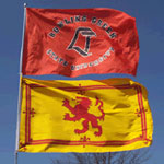
Personally I think Tulsa is too much while too little looks like this:
Image
Inventor of the Clusterf**k and Shoot offense.
User avatar
Jacobs4Heisman
a.k.a. Capt. Rex Kramer
Posts: 7889
Joined: Wed Nov 10, 2004 7:59 pm
Location: Aliquippa, PA

Post by Jacobs4Heisman »

1987alum wrote:
If I were Tulsa, I'd use the hurricane warning flags on the helmet in some fashion.

I'd go with a piece of plywood.
Roll Along!
User avatar
1987alum
Noah's Dad
Noah's Dad
Posts: 7691
Joined: Mon Jul 26, 2004 12:54 pm
Location: Philly

Post by 1987alum »

Check out this "old school" logo from the Portland Storm!

Image
User avatar
TG1996
Peregrine
Peregrine
Posts: 12708
Joined: Fri Jul 23, 2004 3:27 am
Location: Indianapolis
Contact:

Post by TG1996 »

Using red as more than an accent would be too much in their case. I look at their colors as being blue and gold. The red comes up in the flags and they use it as trim, and it's done well.

White is universal, and the black is (again, as far as I can tell) only in the flag logo on the pants. So to say they have "five colors" is a bit much. They have three at most, and I'd even say 2 1/2. Nothing wrong with that.
"I don't believe I can name a coach, anywhere, anytime, anyhow, who did it better than Doyt Perry."
-1955 BG Assistant Bo Schembechler

BGSUsports.com - Where ESPN.com goes for BG history.
User avatar
Falcon30
Tubist / Human SubWoofer
Posts: 2613
Joined: Sat Jul 24, 2004 2:52 pm
Location: South Amherst, Ohio

Post by Falcon30 »

TG1996 wrote:Using red as more than an accent would be too much in their case. I look at their colors as being blue and gold. The red comes up in the flags and they use it as trim, and it's done well.

White is universal, and the black is (again, as far as I can tell) only in the flag logo on the pants. So to say they have "five colors" is a bit much. They have three at most, and I'd even say 2 1/2. Nothing wrong with that.
Image

We'll agree to disagree on the use of red. The logo uses black a lot more prominently because of the flags but doesn't mix in the godawful red outline in addition to the white outline.
Inventor of the Clusterf**k and Shoot offense.
User avatar
Dayons_Den
aka Joe Bair's Lair
aka Joe Bair's Lair
Posts: 5015
Joined: Fri Jul 23, 2004 2:58 pm
Location: Baseball Grounds of Jacksonville
Contact:

Post by Dayons_Den »

"Tulsa fan" (man that Rome-ism) is dorky, thinks we took our colors from the Browns. . . hehe
all bowling green
moneymaker02
Peregrine
Peregrine
Posts: 1049
Joined: Fri Nov 04, 2005 3:05 pm
Location: Charlotte, NC

Post by moneymaker02 »

i dont think we have ne room to be talking about ugly uniforms when we have uni's such as our brown ones. god i hope we dont wear those for the nation to see, we'll the laughing stock of the nation
User avatar
Falcon30
Tubist / Human SubWoofer
Posts: 2613
Joined: Sat Jul 24, 2004 2:52 pm
Location: South Amherst, Ohio

Post by Falcon30 »

1987alum wrote:Check out this "old school" logo from the Portland Storm!

Image
That's kind of cool

Image
Inventor of the Clusterf**k and Shoot offense.
Post Reply