
What helmet should the boys wear in '05?


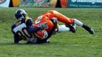

If we wore all brown against Boise's all blue on that Smurf turf, ESPN would have a total of 73 viewers nationwide. I would probably not be able to sit in the stands for the entire game with that sight. I would need at least 10 minutes of game time walking around the concourse to rest my eyes.Bleeding Orange wrote:WAAAAIIIITTTTT!!!!!!!!!!!!!!!!!!!!
Try to imagine that against BOISE STATE ON A BLUE DAMN FIELD.....
I'm going to the hospital right now.


-
BGSU Falconz
- The Wizard of AZZ

- Posts: 596
- Joined: Sun Apr 11, 2004 10:44 pm
- Location: Dayton, Ohio
- Contact:
Re: Helmet Idea
Not sure people would understand the use of a red X.LakelandRocket wrote:
Re: Helmet Idea
A red X???BGSU Falconz wrote:Not sure people would understand the use of a red X.LakelandRocket wrote:
A "site admin" using Internet Explorer?!?!? Grant should have your ass for that!
(and with that, I'll put the geek side away for awhile. sorry.)
-
BGSU Falconz
- The Wizard of AZZ
- Posts: 596
- Joined: Sun Apr 11, 2004 10:44 pm
- Location: Dayton, Ohio
- Contact:
Re: Helmet Idea
Sorry for not being on the Firefox bandwagonTG1996 wrote:A red X???BGSU Falconz wrote:Not sure people would understand the use of a red X.LakelandRocket wrote:
A "site admin" using Internet Explorer?!?!? Grant should have your ass for that!
(and with that, I'll put the geek side away for awhile. sorry.)
-
BGSU Falconz
- The Wizard of AZZ
- Posts: 596
- Joined: Sun Apr 11, 2004 10:44 pm
- Location: Dayton, Ohio
- Contact:
Anyway, the more I think about it, the more I like the way the retail mark looks on the helmet. It's very stylish, and I think it would impress the non-fans who think the old logo is stupid.
Maybe give it a white border or something, and I think it could stand out and look really sharp.
And if that doesn't appease the fans, I think the retooled athletic logo has a lot of potential. It still uses the old logo as the base, which would please the traditionalists, but has a little extra flair to it.
-
Schadenfreude
- Professional tractor puller

- Posts: 6983
- Joined: Fri Jul 23, 2004 7:39 am
- Location: Colorado

I like it as well. But it has an awful lot of orange that would blend into the rest of the helmet. I'm not sure if a white border fixes that.BGSU Falconz wrote:Maybe give it a white border or something, and I think it could stand out and look really sharp.
The retooled logo is my least favorite. One of the best things about our traditional logo was how sleek and abstract it was. The new thing is cluttered.And if that doesn't appease the fans, I think the retooled athletic logo has a lot of potential. It still uses the old logo as the base, which would please the traditionalists, but has a little extra flair to it.
I get what they were trying to do: Come up with a transition to the retail mark. But, in artistic terms, the new traditional logo is the least attractive of the three... in my humble opinion.
Re: Helmet Idea
BGSU Falconz wrote: Sorry for not being on the Firefox bandwagon
-
Dayons_Den
- aka Joe Bair's Lair
- Posts: 5015
- Joined: Fri Jul 23, 2004 2:58 pm
- Location: Baseball Grounds of Jacksonville
- Contact:
The thing I like about the retooled logo is that it gives thickness to our logo. Like with the traditional one, is the space in the middle part of the logo or should it be "clear" if it were a sticker? The old football helmet logo was the only time that logo had thickness, more than just an outline of the falcon head. I like the new one because it shows, without a doubt that the middle of the logo is brown.Schadenfreude wrote:I like it as well. But it has an awful lot of orange that would blend into the rest of the helmet. I'm not sure if a white border fixes that.BGSU Falconz wrote:Maybe give it a white border or something, and I think it could stand out and look really sharp.
The retooled logo is my least favorite. One of the best things about our traditional logo was how sleek and abstract it was. The new thing is cluttered.And if that doesn't appease the fans, I think the retooled athletic logo has a lot of potential. It still uses the old logo as the base, which would please the traditionalists, but has a little extra flair to it.
I get what they were trying to do: Come up with a transition to the retail mark. But, in artistic terms, the new traditional logo is the least attractive of the three... in my humble opinion.
all bowling green
-
Godsgirlerific
- Chick

- Posts: 274
- Joined: Sun Oct 31, 2004 11:11 pm
- Location: Bowling Green by way of Gahanna

1. I do NOT want the new falcon on the helmet. I guess I'm a sucker for tradition, but I don't think anything should replace the traditional falcon. It's so unique, and the new falcon looks like all the rest of the bird logos- remember how everyone was comparing it to Miami's logo when it first appeared?
2. I LOVE Dayon's brown helmet and jersey. The jersey has enough orange in it to stand out, but it also has enough brown in it to make it look like we aren't ashamed of one of our school colors.
3. Hopefully with the increased exposure BG is getting, people won't constantly say, "I thought one of BG's colors was green..." :rant:
How about back to my original idea of a white helmet with the retail mark? Of course the stripes on the helmet would need to be brown and orange instead of brown and white.Dayons_Den wrote:Schadenfreude wrote:I like it as well. But it has an awful lot of orange that would blend into the rest of the helmet. I'm not sure if a white border fixes that.BGSU Falconz wrote:Maybe give it a white border or something, and I think it could stand out and look really sharp.
"An intelligent man is sometimes forced to be drunk to spend time with his fools."
- Ernest Hemingway
- Ernest Hemingway
-
Dayons_Den
- aka Joe Bair's Lair
- Posts: 5015
- Joined: Fri Jul 23, 2004 2:58 pm
- Location: Baseball Grounds of Jacksonville
- Contact:
