
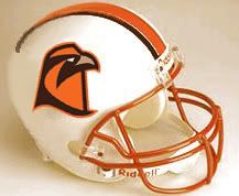
Now, this is something which is intriguing to me. It would look very good with white/white. It would look even better with white pants and BROWN tops.Dayons_Den wrote:A quick mock up of a white helmet with a "tooth" stripe thing to match the pants more- it narrows in the back
The more I look at this the more I am kind of warming up to it. .. . I really like the orange facemask.
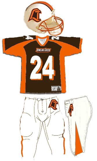
What helmet should the boys wear in '05?
-
Rightupinthere
- Mercenary of Churlishness

- Posts: 6549
- Joined: Fri Jul 23, 2004 7:53 am
- Location: Ye Olde Pigeon Hole
Re: Per Your Request Warthog
"Science doesn’t know everything? Well science KNOWS it doesn’t know everything… otherwise it’d stop."
Dara O'Brian - Comedian
Dara O'Brian - Comedian
-
Schadenfreude
- Professional tractor puller
- Posts: 6983
- Joined: Fri Jul 23, 2004 7:39 am
- Location: Colorado

Re: Per Your Request Warthog
It's growing on me very quickly, too. I like it a lot.Rightupinthere wrote:Now, this is something which is intriguing to me... It would look very good with white/white. It would look even better with white pants and BROWN tops.
Another request for Dayons Den
DD,
How about another white one with the new retail mark peeking out from behind the new BG font? Just curious how that would look.
How about another white one with the new retail mark peeking out from behind the new BG font? Just curious how that would look.
"An intelligent man is sometimes forced to be drunk to spend time with his fools."
- Ernest Hemingway
- Ernest Hemingway


-
Dayons_Den
- aka Joe Bair's Lair
- Posts: 5015
- Joined: Fri Jul 23, 2004 2:58 pm
- Location: Baseball Grounds of Jacksonville
- Contact:
I'm with you on the "retail" logo. I do really like the new athletic logo though. And I will say that the new "retail" logo could have been worse. . . (anyone see the weird logos they were throwing around in the late 90s?? those were bad)1987alum wrote:As a designer, I would caution folks, because there's no doubt that most any intensely colored logo is going to look better on a white background. That being said, I still do not like the new "retail" logo.
all bowling green
-
Dayons_Den
- aka Joe Bair's Lair
- Posts: 5015
- Joined: Fri Jul 23, 2004 2:58 pm
- Location: Baseball Grounds of Jacksonville
- Contact:
Off Season Photoshop Phun.
I hope they add the new font to the uniforms- even if it isn't on brown jerseys like this one:
all bowling green
