My only question is why didn't we just go to this when the logo changed? Why go those few years with just the interlocking BG and then wasting money updating them now??
Be Special, Be Different, BE Bowling Green - Dino Babers
Would it really be considered wasting money now when the helmets are more than likely repainted & decals reapplied before every game anyway? Call me crazy, but if you're just applying a different set of decals than before, I don't any difference in cost would be significant.
That being said, I do wonder why they didn't just go to this logo right off the bat. Though I do understand that it is pretty much the official primary logo now, so it makes sense to create some more brand uniformity.
I do like them though and am definitely looking forward to seeing them in action.
The new helmet looks fine, the brown facemask only will be recognizable up close. How many more times though are we going change are football uniforms? All we do is change them over and over......just get a good basic design and stick with it. Our brown uniforms we had 6 years ago were better than anything they've tried since. Figure it out.
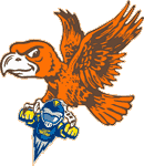
Not a fan of the tapered stripe, and I still miss the good ol' "LT" logo. The peek-a-boo logo is my favorite of our "new" logo collection though, so I suppose it could be worse. I still think "LT" is light years better than any of them.
Overall I agree with Drago...we keep changing uniforms and every year they seem just as lousy as the last. I've never owned a BG jersey largely because we haven't had a design that I really like. My favorite is probably the all orange look of the J5 days. It was gaudy and flashy in a "damn I'll never forget that" kinda way
I didn't care for our brown jerseys because they had no orange at all. Orange is our dominant and most recognizable color, IMO, and NEEDS to be included in any jersey. Even if it's just accent, it needs to be there.
hammb wrote:Not a fan of the tapered stripe, and I still miss the good ol' "LT" logo. The peek-a-boo logo is my favorite of our "new" logo collection though, so I suppose it could be worse. I still think "LT" is light years better than any of them.
Oh yeah!!!!
"Regarding BGSU, I would think their biggest strength is that they never give up, They never slow down and they battle hard even after the other team scores. We have to be on our game and never, ever take the foot off the gas for a second." ~~USCHO Poster "BG was relentless. It's like they know that a good first pass on the breakout from a defenseman will almost always result in an odd-man rush against them - but they go in anyway and dare you to make that pass. All three of their goals were just grit and effort. That's a team any fan can be proud to support...they give all they've got." ~~USCHO Poster, AFTER Tech beat us #NeverGiveUp
#NeverSurrender
#Relentless
#Resiliant
Agree with most of the comments except for the one member of the Greg Brandon fan club. You can't have tradition if you keep changing. I do like the new helmets, but I never really understood the need to get rid of the "LT" logo. It was recognizable and no one had anything like it. They could have just dressed it up a bit, kind of like the Atlanta Falcons and Cincinnati Bearcats did with their logos without really changing them.
That said, I like the helmets. I *HATE* the jerseys and pants with the piping and lack of player names on the jersey.
hammb wrote:Not a fan of the tapered stripe, and I still miss the good ol' "LT" logo. The peek-a-boo logo is my favorite of our "new" logo collection though, so I suppose it could be worse. I still think "LT" is light years better than any of them.
Oh yeah!!!!
LT will always rule in my book.
Hey, look at me! I'm all over the InterWebs! Facebook ~ Twitter @ CoachKarlPA ~ LinkedIn