

Modern throwback helmet
Modern throwback helmet
A friend of mine made some decals for me to put on a helmet for my office. What do you guys think? I love the old LT logo.

Re: Modern throwback helmet
Awesome! Would love to see that on the field on game day.
Re: Modern throwback helmet
Loved that logo.
"Windows are for cheaters, chimneys for the poor.
Closets are for hangers, winners use the door."
-B. Springsteen
Closets are for hangers, winners use the door."
-B. Springsteen

Re: Modern throwback helmet
I like the actual helmet itself but I still dislike that logo and I'm glad we got rid of it. The fact that people outside of BG didn't even know what it was made the case for why it was a poor design. Some people thought it was the letters "L" and "T" and some had no idea what if was whatsoever. If that doesn't scream poor message and design I don't know what does. That old logo just reminds me of something that was created with a 1980's computer graphic design. With our new logo, people know who and what we are when they see it - which is effective and the point. I also have an old helmet with the old logo on it myself, but when I put it side by side with the new one, the new one blows it away.
GO BG!!!
-
Flipper
- The Global Village Idiot

- Posts: 18396
- Joined: Fri Jul 23, 2004 1:01 am
- Location: Ida Twp, MI

Re: Modern throwback helmet
It's ok...I have a sentimental attachment to it because it was one of the logos the university used to market the school when I was a freshman....I'm not married to it though. I like the current logo better.
It's not the fall that hurts...it's when you hit the ground.
Re: Modern throwback helmet
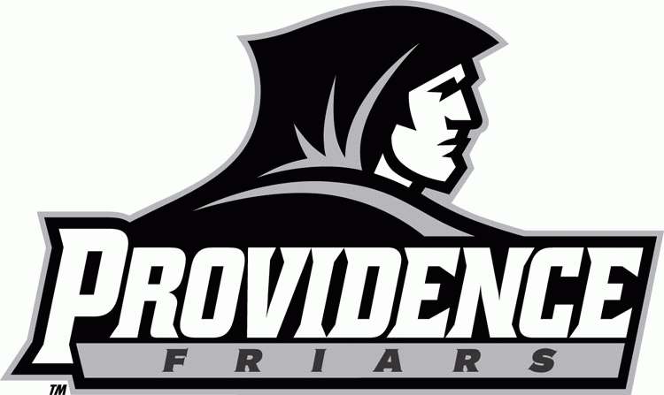
I've always liked the old logo, but, it's the logo I went to school with. I would have liked for them to keep the Falcon and update the lettering. The only thing I can't stand about the new one is, whoever BG hired to create the logo gave Providence the exact same one. Oh well, something to talk about in the offseason.
http://upload.wikimedia.org/wikipedia/c ... t_logo.gif" target="_blank
http://content.sportslogos.net/logos/33 ... d0rqkf.gif" target="_blank
http://collegefootballzealots.com/image ... n-logo.jpg" target="_blank
http://www.screenprintedproducts.com/Im ... Banner.jpg" target="_blank
http://upload.wikimedia.org/wikipedia/c ... t_logo.gif" target="_blank
http://content.sportslogos.net/logos/33 ... d0rqkf.gif" target="_blank
http://collegefootballzealots.com/image ... n-logo.jpg" target="_blank
http://www.screenprintedproducts.com/Im ... Banner.jpg" target="_blank
Re: Modern throwback helmet
I would be pleased to see the older logo appear in a subtle way occasionally. Say, a stamp sized version at the base of the helmet, or on the collar of turtle neck. It would be a nice way to pay tribute to the last few decades. 
SAme old Same old
Re: Modern throwback helmet
I LOVE our new logo and consider it one of the finest in all of college sports. That being said, I think a day with helmets with the throwback logos and the brown jerseys from 2006-07 would be sweet.
MarkL has spoken.
You may all now return to your daily lives.
You may all now return to your daily lives.
-
Falconfreak90
- Rubber City Falcon
- Posts: 18541
- Joined: Fri Jul 23, 2004 9:28 am
- Location: Green, OH
- Contact:
Re: Modern throwback helmet
That helmet looks pretty cool!
Michael W.
BGSU-12 TIME MAC CHAMPION
FALCON FOOTBALL ROCKS!
BGSU-12 TIME MAC CHAMPION
FALCON FOOTBALL ROCKS!
-
Falcon Fanatic
- Peregrine

- Posts: 6798
- Joined: Thu Jul 22, 2004 11:23 pm
- Location: BG
Re: Modern throwback helmet
I am a die hard when it comes to the old LT logo. But, that said, I've really gotten used to the new one and like it a lot...now. I still like the old one better and always will, but now have plenty of stuff with the new one on it and I'm fine with that. I do, however, ALWAYS wear my Falcon head LT logo necklace and have had MANY people comment on it recognizing it as a BG logo!
FALCONS FOREVER, BABY!!!
FALCONS FOREVER, BABY!!!
"Regarding BGSU, I would think their biggest strength is that they never give up, They never slow down and they battle hard even after the other team scores. We have to be on our game and never, ever take the foot off the gas for a second."
~~USCHO Poster
"BG was relentless. It's like they know that a good first pass on the breakout from a defenseman will almost always result in an odd-man rush against them - but they go in anyway and dare you to make that pass. All three of their goals were just grit and effort. That's a team any fan can be proud to support...they give all they've got."
~~USCHO Poster, AFTER Tech beat us
#NeverGiveUp
#NeverSurrender
#Relentless
#Resiliant
Re: Modern throwback helmet
As with the uniforms, the degree of beauty of the logo is in the eye of the beholder. To say we are better off with the new one because the old one looks like it was done with a 1980's graphics program is not a good argument. Take a look at the logo for some of the big conference schools.............Michigan, Miami (FL), Michigan State, Tennessee, Clemson, Kansas State - to name just a few. Our old logo doesn't look any more dated or any less imaginative than any of those and many others. Just because it's not new and fancy, doesn't make it bad. There's something to be said for tradition.
The issue with it not being instantly recongizable as Bowling Green's logo could have been addressed with better marketing and more success athletically against the bigger schools.
It's water under the bridge now, as what is done is done and we are not going to switch back. That said, I agree with a previous poster in wanting to see the old logo still appear at least as a secondary logo from time to time, as a nod to tradition. There's room to work in both.
-
Falcon Fanatic
- Peregrine
- Posts: 6798
- Joined: Thu Jul 22, 2004 11:23 pm
- Location: BG
Re: Modern throwback helmet
+10000000000000Beaker wrote:It's water under the bridge now, as what is done is done and we are not going to switch back. That said, I agree with a previous poster in wanting to see the old logo still appear at least as a secondary logo from time to time, as a nod to tradition. There's room to work in both.
"Regarding BGSU, I would think their biggest strength is that they never give up, They never slow down and they battle hard even after the other team scores. We have to be on our game and never, ever take the foot off the gas for a second."
~~USCHO Poster
"BG was relentless. It's like they know that a good first pass on the breakout from a defenseman will almost always result in an odd-man rush against them - but they go in anyway and dare you to make that pass. All three of their goals were just grit and effort. That's a team any fan can be proud to support...they give all they've got."
~~USCHO Poster, AFTER Tech beat us
#NeverGiveUp
#NeverSurrender
#Relentless
#Resiliant
~~USCHO Poster
"BG was relentless. It's like they know that a good first pass on the breakout from a defenseman will almost always result in an odd-man rush against them - but they go in anyway and dare you to make that pass. All three of their goals were just grit and effort. That's a team any fan can be proud to support...they give all they've got."
~~USCHO Poster, AFTER Tech beat us
#NeverGiveUp
#NeverSurrender
#Relentless
#Resiliant
-
San Diego Falcon
- Peregrine
- Posts: 1369
- Joined: Mon Feb 21, 2005 4:26 pm
Re: Modern throwback helmet
Funny - I never even noticed the "LT" in the logo until this thread. It always just looked like a falcon to me.
"but when you look at ths team beyond the suck , you see a glorious future again" - MACMAN
-
bgsufalcon24
- Peregrine
- Posts: 4072
- Joined: Tue Nov 15, 2005 1:46 pm
- Location: Strongsville, Ohio
Re: Modern throwback helmet
I absolutely hated this logo and was so incredibly happy that they decided to change it while I was on campus. Out with the old and in with the new, so to speak.
That being said, I'm definitely not opposed to breaking this out as an alternate every so often.
That being said, I'm definitely not opposed to breaking this out as an alternate every so often.
24. Quality provider of the truth, for better or for worse.
